Improved Mobile Joomla! Mobile Device Support And New Releases
Monday, 21 January 2013 15:07
Today brings us a bunch of new version releases to our major products! We have improved Mobile Joomla's mobile device support and are launching Mobile Joomla! 1.2.3, Mobile Joomla! Pro 1.2.5, and Mobile Joomla! Elegance Template 1.2.4.
As mentioned, most of changes are related to improved device detection. We now cover almost 16,000 device and bot profiles in the AMDD database, and over 23,000 in the Mobile Joomla! Pro remote database!
And as of today, our device databases include also other device categories in addition to phones, smartphones, and tablets! Mobile Joomla! processes them in following manner:
- Smart TVs are mapped to the usual desktop mode
- TV Game Consoles are mapped to the desktop mode too
- Portable Game Consoles are mapped to the smartphone mode
Please find below more detailed description of the changes for Mobile Joomla! and Elegance.
Mobile Joomla! Standard and Pro
- The AMDD plugin is updated with improved support of Windows Phone 8, game consoles, Smart TVs, and many other devices
- Improved screen size detection in “databaseless” Mobile-Simple plugin
- Updated Remote Device Database RDDB API (MJ Pro)
- ScientiaMobile plugin is updated to the latest ScientiaMobile API (MJ Standard only)
Mobile Joomla! Elegance Template
- Fixed display problems with Windows Phone 8
- Updated add-to-homescreen feature to the latest version
- Added support for iPad Retina webapp icon (144x144 px)
- Included samples of iPad icons (72x72 and 144x144 px)
- Added support for additional webapp startup images:
- 640x920 iPhone retina
- 640x1096 iPhone 5
- 768x1004 iPad portrait
- 1024x748 iPad landscape
- 1536x2008 iPad retina portrait
- 2048x1496 iPad retina landscape
Go and download the latest versions of Mobile Joomla! and Mobile Joomla! Pro, and Mobile Joomla! Elegance Template now!
As normal, please take a backup before upgrading to the new versions.
Mobile Joomla! 2012 In Retrospect And Outlook For 2013
Monday, 07 January 2013 00:00
 Hey all, we hope you've had a great start into 2013 so far! Last year was awesome for us - we couldn't be happier with the progress we made. We launched several new products, including Elegance Mobile Joomla! template, Kunena Mobile Extension, JComments Mobile extension, and of course Mobile Joomla! Pro and Club. Huge thanks to all of you over thousand premium users who have trusted us so far!
What's most important, our community has continued to grow amazingly fast! We want to thank you all for your feedback, both positive and constructive. It motivates us to keep on improving our products further.
Mobile Joomla! Highlights From 2012
- We released 11 version updates to the Mobile Joomla! standard version
- We released 8 version updates to the Mobile Joomla! Pro version
- We released 27 version updates to the Mobile Joomla! Elegance template
- We released 10 version updates to the Mobile Joomla! Kunena and JComments extensions
- We released Responsive Template Analyzer to test how much your responsive site could gain with Mobile Joomla! and RESS
Responsive Joomla!
In some arenas, the year 2013 has been claimed to be the year of responsive design. Responsive Joomla! templates are indeed growing in popularity and we are happy with the focus on mobile. However, as we stated before - for the sake of all your mobile visitors, optimizing responsive templates on server-side is an essential step. If you missed our Responsive vs. Server-side Mobile Solutions Infographic, check it out!
Otherwise, we're looking forward to Joomla! 3+ gaining wider adoption this year. The mobile-ready Boostrap features of Joomla! 3 combined with Mobile Joomla! server-side device detection and optimization will ensure your Joomla! 3 sites will rock on mobile like never before!
Finally, for the beginning of this year, we have two new product announcements.
Update To Remove Support Ads Module
As you know, to support the development, Mobile Joomla! displays unobstructive support ads, which has been made possible to remove with a free extension. For a long time, we have been receiving a lot of requests for a way to donate to Mobile Joomla! in exchange for using our Remove Support Ads extension. From the beginning of this year, we made the Remove Support Ads extension available for a reasonable, one time fee.
We understand many of our avid users get much more value than that from the Mobile Joomla! extension, but if you want to support us, you can always opt for our other paid products. Our Elegance template, as well as Pro and Club users continue to get the extension included as part of their subscriptions.
Mobile Joomla! Official Insider's Guide Ebook
This is an ebook we wanted to do for a long time, and we were finally able to release in December. With 120 pages, the ebook is a complete how-to manual for Mobile Joomla! and explores the details of all aspects of the extension, as well as tips and tricks for customizing and tweaking it for your needs. The Guide comes included with the Elegance template purchase, and in our Pro and Club subscriptions. Other Mobile Joomla! users can buy it here: Mobile Joomla! Official Insider's Guide
Special Offer!
We are offering a bundle of the Remove Support Ads module and the Official Insider's Guide ebook for a total price of $29.90 for a limited time! That's savings of $29.90 compared to the normal prices of the products. Get yours now!
That's all for now! We'll finish with a question: What would you like to see from us in 2013?
New Mobile Joomla! Updates
Wednesday, 19 December 2012 00:00
Ho ho ho! Santa's little elves have been busy at work. Today we are releasing updates to three Mobile Joomla! packages: Mobile Joomla! Standard 1.2.2, Mobile Joomla! Pro 1.2.4, and Mobile Joomla! Template Elegance 1.2.3. Below are the cumulative updates done since our last public version announcement:
Updates Common To Both MJ Standard And MJ Pro
- Fixed issue with pagination on mobile homepage
- Fixed possible warning in MJ's Extension Manager
- Fixed display of external images
- Reduced file size of rescaled jpeg images (by removing comment header)
- Updated the AMDD device database
- Fixed issue with caching (Joomla! 1.5)
- Fixed issue with mobile homepage in menu (Joomla !1.6+)
Mobile Joomla! Pro
- Fixed online device database issues with PHP 5.0 & 5.1
Mobile Joomla! Standard
- Support for ?device=auto parameter in URL (was introduced in MJPro 1.2.1)
- Fixed issue with empty list of menu items on MJ settings page
Elegance Mobile Joomla! Template
- Fixed hash processing in the case of disabled AJAX navigation
- Fixed unclosed [link] tags in Joomla!1.5
- Fixed height of external images
Enjoy the updates!
Responsive Design vs Server Side solutions (Infographic)
Monday, 03 December 2012 00:00
 Today, responsive design is mostly implemented client-side: All assets are loaded independent of the browsing device. In practice, this is like going on a beach holiday and bringing your ski wear, winter jacket, and business attire with you - just in case. No wonder this often leads to wasted bandwidth, higher mobile bounce rates, lower time spent on the mobile site, and lower conversions on mobile commerce. Interestingly, this story even gets physical: 4% of users get so frustrated about sluggish mobile sites that they throw their devices on the wall!
Problem: Websites Are Growing Bigger All The Time
The websites are growing bigger all the time, the average webpage is now over 1.2MB according to HTTParchive.org. If the same trend continues, the average page will be over 2.4MB in 2014!
This fact, combined the trend of many people jumping into responsive design and responsive templates as the (often uneducated) mobile "solution" is going to cause rapidly increasing usability problems for the average mobile web visitor. We are not against responsive design as we have explained, but it has major delivery problems at the mobile side of things at the moment, and these won't be fully solved for the mass-market devices until a few years from now.
The top internet brands like Google, Facebook and Yahoo use server-side mobile solutions - quite simply, for the speed. It has been found out in studies that the average mobile user is only willing to wait a maximum of four seconds for content to load on their devices.
These trends are why we have teamed up with BraveNewCode, the provider of the hugely popular WPtouch plugin for Wordpress. Our teams together represent the two most popular mobile solutions in the open source community, and we want to raise discussion and awareness on this important topic.
Our joint best practice recommendation is that to optimize your mobile site delivery you should use server-side tools that have been shown to result in page sizes up to 500% smaller than their desktop counterparts, and load up to 400% faster than web pages not using a server-side mobile solution.
Infographic: Responsive Design Vs. Server-Side Solutions

Click on the thumbnail below to see
A few collected tweetable facts from the infographic:
Average webpage is now 1.2MB. If the trend continues, the avg page is >2MB in 2014! Tweet This stat!
10.3% of all web browsing is now done from smartphones and tablets. Tweet This stat!
4G/LTE network connections are 12% slower than desktop. Tweet This stat!
Mobile browsing latency can be up to 96% slower than desktop. Tweet This stat!
97% of mobile latency slowness happens on the device side. Tweet This stat!
64% of smartphone owners want mobile sites to load in <4s. Tweet This stat!
85% of mobile users expect mobile sites to load as fast as on desktop. Tweet This stat!
23% of frustrated mobile site visitors curse at their phones and 4% throw them. Tweet This stat!
Mobile Site Bounce Rate spikes by 100% when pages take over 4s to load. Tweet This stat!
Mobile Site Bounce Rate jumps by 150% when pages take over 8s to load. Tweet This stat!
Server-side tools could improve mobile performance of >55% of Joomla! sites. Tweet This stat!
Server-side tools could give ~30% of Joomla! sites >100% mobile performance boost. Tweet This stat!
Average WPtouch Pro pages load 75% faster than their desktop counterparts. Tweet This stat!
Copy the code below to embed this infographic into your web page:
<a href="http://www.mobilejoomla.com/mobile-joomla-blog/172-responsive-design-vs-server-side-solutions-infographics.html"><img src="http://www.mobilejoomla.com/media/press/responsive-vs-serverside/Responsive-Design-vs-Server-Side-Solutions-Infographic.jpg" title="Infographics: Responsive Design vs. Server-Side Solutions" alt="Infographics: Responsive Design vs. Server-Side Solutions" /></a>
What is your opinion on the topic? Let us know below in the comments!
You can find more assets in our Press folder should you wish to write about this topic and copy the infographic to your own website.
For more details on the topic, check our Whitepaper (PDF, 2MB): Server-Side Solutions Vs. Responsive Design
Testing Mobile Websites With Browshot
Friday, 30 November 2012 16:30
Note: this is Part VI of our 8 part series introducing desktop tools for testing mobile sites.
 It's been a while since we posted our last tip on this series. But we're not finished yet! Today we'll proceed by introducing Browshot.
Browshot is a service to easily create screenshots of web pages in any screen size, as any device: iPhone, iPad, Android, Nook, PC, etc. The service is simple to use: you get to select a mobile device, the screen orientation, and then you can request a screenshot of any website. The shot will be generated using the Browshot's virtual browsers and delivered to you almost instantly (they mention an average of 15 seconds).
There are a few limitations, however: First, there’s a quite limited set of mobile devices; Second, apparently the screenshots are cached for 24 hours, so same day changes with the exactly same URL won’t show up (this could be bypassed by adding empty parameters to the URL, or using their API). For high-volume customers the firm also offers customizable browser setups (e.g. any screen size ratio).
Works on: Any browser
Requirements: N/A
Price: Browshot uses credits system for paying for the screenshots. Mobile shots take 2 credits. You can get 20 credits for free for signing up to their newsletter and sending a tweet. Credits are sold in packs starting from $1 per 10 credits and up to $1,000 per 300,000 credits.
Pros
- Very easy, simple, and fast to use (the average time, including page load, to finish a screenshot is just 15s).
- Affordable pricing for small batches.
- Configurable - each feature (Flash/HTML5/CSS/JavaScript/Image loading) can be enabled and disabled on demand. They also have an API.
Cons
- Limited device selection.
- Iterative development difficult with only screenshots - also, the service caching can be a nuisance.
Do you have your own tips or comments, or have we missed something? Let us know in the comments below!
Mobile Joomla! Pro and Elegance Mobile Joomla! Template 1.2.1 Released
Thursday, 08 November 2012 00:00
Hey there! A quick note that we have just released 1.2.1 updates to Mobile Joomla! Pro and Elegance Mobile Joomla! Template. The new versions include the following improvements:
Mobile Joomla! Pro
- Separate setting for jpeg quality of retina images: you can now choose the jpeg quality level (0-100%) used for retina images.
- Improved support for Windows Phone 8 in the offline version of Mobile-AMDD plugin
- Support for device=auto parameter, which can be used to reset mobile view mode (domain.com/?device=xhtml | iphone etc.) to default mode. (Can be useful in case your browser has any issues switching between modes)
 Mobile Joomla! Retina image scaling setting
Elegance Mobile Joomla! Template
- It's now possible to use also jQuery Mobile 1.1.0 (backward compatibility with Elegance 1.1.x) instead of jQuery Mobile 1.2.0
- Added support for anchor_css parameter mobile menu module
- Fixed onBeforeCompileHead event
- Fixed possible "Strict standards" notice in Joomla! 1.5
Responsive Design Vs. Server-Side Solutions With Mobile Joomla! And BraveNewCode (Podcast)
Tuesday, 06 November 2012 15:00
") Hey all, we're announcing a new smashing, fresh, right out of the oven podcast for you to listen to! We did an interview for a podcast on Dev1.tv together with BraveNewCode's (the WPTouch guys) Co-Founder Dale Mugford. The topic was Responsive Design Vs. Server-Side Solutions. Go and listen to it now!
Hey all, we're announcing a new smashing, fresh, right out of the oven podcast for you to listen to! We did an interview for a podcast on Dev1.tv together with BraveNewCode's (the WPTouch guys) Co-Founder Dale Mugford. The topic was Responsive Design Vs. Server-Side Solutions. Go and listen to it now!
In the podcast, we discuss and compare some of the main points regarding responsive design and server-side mobile solutions, which are sometimes referred to as “dynamic serving” – like Mobile Joomla! and the WPtouch plugin.
In this article, we'll provide a summary of the topics discussed in the podcast, as well as some additional material. Read on!
Overall, the differences between responsive design techniques and server-side approaches can be broken down into four categories:
Technical
One of the significant benefits of server-side solutions is fast and efficient delivery of content. Many studies and surveys have shown that people are only willing wait around 4 seconds for content to display on smartphones.
The server-side solutions can deliver mobile pages that are up to 500% smaller than their desktop counterparts by serving images optimized for the client browser and removing unnecessary scripts from being sent to the client at all. These things are not technically possible in the responsive approaches currently.
The server-side optimized pages also load up to 400x faster which is critical for low bounce rates and higher page views. While mobile cache limits are easily exceeded, so that the website assets need to be requested over the air over and over again, heavy sites can also significantly slow down, and even crash some mobile browsers.
Some have argued that Google has recommended responsive design as the preferred solution. Well, Google isn't really recommending responsive design for all. What they really say is that you should build a site that makes sense for your users. Elsewhere in the news, you might have noticed Google and Microsoft stating “Every millisecond matters” - people will visit a website less often if it is slower than a close competitor by more than 250 milliseconds (250 thousandths of a second). Speed matters.
In any case, if you are using a responsive template, you better pay attention to how well your site really is optimized, after all, for mobile. It's not just the layout, it's the page size and loading time as well. You can try our Responsive Template Analyzer to estimate how much you could improve your Joomla! site's mobile performance if you had Mobile Joomla! installed to optimize your site on the server-side. Read more about the client-side and server-side differences and responsive server-side development.
Design
Designing a good mobile user experience is much more than just making sure that the logo looks the same across various browsers and screen sizes. Good design also includes usability factors and not just the visual layout. Server-side solutions put focus on the content formatting requirements. This ensures a polished, dependable design is provided for all site visitors regardless of the device.
Server-side solutions can, however, require additional work in order to maintain similar branding across devices. The fact that the responsive design is based on a single set of styles used for all devices that provides consistent design, is probably its strongest benefit. Although, many semi-smartphones and feature phones may have serious problems coping with the size of the responsive pages, as well as non-supported scripts and other styling.
Content
The differences between the approaches are clear when it comes to content that is inappropriate for mobile visitors. With responsive design, the inappropriate content is sent to the client device and only ‘hidden’ through stylesheet formatting. With server-side solutions webmasters can specify the content that is not applicable to mobile visitors - and the content will not be delivered to their devices, further streamlining and optimizing the mobile display of content.
Maintenance
It's often said successful responsive design should start "mobile first." Day to day maintaining of responsive design may mean reliance on expert web designers who have strong enough grasp of both mobile technologies and mobile design skills. Also, responsive design best practices are a very much still work in process.
On the contrary hand, many server-side solutions are built to be convenient to handle for the site owner, using easy-to-use interface to apply updates and changes.
Now listen to the full Dev1.tv “Responsive Design vs. Alternate Mobile Solutions” podcast!
Further reading:
Weighing Options: WPtouch, Responsive Design and Your Mobile Strategy by BraveNewCode.
--
What do you think about the topic? Let us know below in the comments!
Mobile Joomla! Recommends SiteGround Hosting
Thursday, 25 October 2012 00:00
Please see a special deal for Mobile Joomla! community at the end of this post!
Choosing a hosting company is one of those decisions that many don’t ponder for too long, but might end up regretting sometime later. A good hosting service is kind of invisible - when everything works and potential issues are handled quickly and thoroughly, you don’t think about it at all in everyday business. But if things go wrong, it surely affects your whole web business, sometimes with detrimental results. Even if there are no catastrophes, you might end up in surprising obstacles and time-consuming issues when you have a need to change some advanced settings or extend the functionality.
The perfect website hosting is fast, reliable, affordable, and totally secure. Also of essence is that it is always possible to get fast and helpful responses to any support questions and requests. And when Joomla! is the platform of choice, it’s great if the hosting partner also understands Joomla! and related needs and requirements. For us it’s also important that Mobile Joomla! runs perfectly on a hosting environment.
SiteGround’s servers are perfectly optimized for running Joomla! and we’ve tested that Mobile Joomla! runs great in Siteground’s environment as well (something that isn’t always granted). They ofer shared hosting, semi-dedicated services, cloud VPS and fully managed dedicated solutions. Furthermore, a benchmark speed test commissioned by SiteGround in May 2012 showed that SiteGround reached better results than the majority of 17 leading general hosting companies as well as a few Joomla! specific companies (think BlueHost, DreamHost, FatCow, GoDaddy, Rochen, etc.), using the same Joomla! installation with sample data.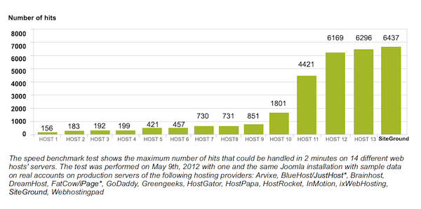
Here are some of the distinctive features of SiteGround that we favor the most:
- Three global geolocations
Siteground has datacenters in three geographical locations, in the USA (Chicago, Illinois), Europe (Amsterdam, The Netherlands) and in Singapore Each customer can choose where to host his/her website and achieve the maximum loading speeds for the targeted markets. - Unique Shared Hosting Security
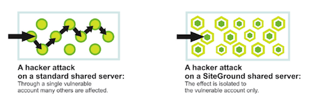
Shared hosting is the most massively used, but since it accommodates many users on one server, there are some inherent security problems. For example, on a shared server it is common for a whole machine with hundreds of active websites on it to be down due to a single vulnerable account. One of SiteGround’s inventions is unique software that isolates shared hosting accounts in a way no one has done before. It isolates the accounts from each other and does not allow the whole server to be affected through a single user. - Unique Server Setup For Maximum Loading Speed
SiteGround has deployed a unique combination of hardware and in-house customized software to form a setup that’s been architected and tested to brings up the best results, i.e. amazing loading speed to users. They currently run powerful hardware with RAID and store MySQL on SSD hard drives. Also the Apache and the PHP handlers are tweaked to provide the fastest performance possible, supported by their custom caching mechanisms. - Unique Server Monitoring For The Best Uptime
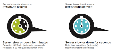
Another piece of software invented by SiteGround is a proactive monitoring system that sees the server status in real time and resolves more than 90% of the server performance issues instantly, with no human interaction needed. That means there will be not be typical cycle of first detection time of several minutes and then a reaction time of several minutes that add to cumulated downtime. - Fast and Secure Joomla! Installation
SiteGround provides a thoughout tutorial and Softaculous, a quick installer, to get Joomla! up within seconds. SiteGround also has developed a security extension, jHackguard, to protect Joomla websites hacking attacks like SQL Injections, Remote URL/File Inclusions, Remote Code Executions and XSS Based Attacks. - Fast Support
SiteGround has 24/7 ticketing, phone, and chat support. They advertise average ticket response time of 15 minutes, average phone call wait time of 5 seconds, and no practical wait time with online chat.
As a Joomla user, you can also get free Joomla tutorials, free Joomla templates and extensions along with the standard features you’d expect from a hosting provider.
A Special offer for Mobile Joomla! community
We at Mobile Joomla! have partnered up with SiteGround and recommend their service if you are looking for a new hosting provider, which also performs well on mobile.
Celebrating our cooperation, we want to introduce a special deal for you: If you sign up using the link below, you will be eligible for a -40% off special deal for Mobile Joomla users.
Get -40% SiteGround Hosting deal! (just follow the link and click the "Get Started" button to register!)
Let us know your comments and feedback, and spread the word on Twitter and Facebook.
More Articles...
- Mobile Joomla! 1.2 with Joomla! 3.0 Support
- BrowserStack: Web-Based Cross Browser Testing
- Using DeviceAnywhere For Desktop Mobile Testing
- Mobile Emulators from Device Manufacturers (OEM)
- Firefox Mobile Developer Tools
- Mobile Joomla! Showcase: Webfor Web Design & SEO
- Opera Mobile Emulator For Desktop
- 8 Ways To Test A Mobile Site on Different Mobile Devices
Page 8 of 17
«StartPrev12345678910NextEnd»