Mobile Joomla! 1.2.6 and Mobile Joomla! Pro 1.2.8
Wednesday, 17 July 2013 00:00

Hey all, it's time for another update! Mobile Joomla! 1.2.6 and Mobile Joomla! Pro 1.2.8 are now available.
Changes and improvements:
- Improved compatibility with Joomla! 3.x (fixed homepage detection, fixed compatibility with System-Cache plugin)
- Improved SEO (remove possible duplicates: disable indexing of "forced" mobile versions and set “canonical” metatag in 3rd party mobile templates)
- Fixed several caching-related issues
- Due to lots of feedback, we have made the Scientia Mobile plugin available as an additional plugin (available at Mobile Joomla! Extensions directory)
- Updated backend design
- Updated AMDD database (more new devices!)
As always, you can update to the new version from your administrative panel via Mobile Joomla! Remote Update feature, or by downloading Mobile Joomla! package and installing it from the back-end. Do not forget to backup your website before the upgrade!
Remember to subscribe our RSS feed, follow us on Twitter and like our Facebook page to keep on top of all latest Mobile Joomla! news.
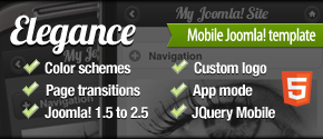
Mobile Joomla! Elegance Template 1.3.0 Release
Wednesday, 19 June 2013 00:00
It's time to release next version of the Elegance Mobile Joomla! template with significant improvements:
- Based on latest version 1.3.1 of the jQuery Mobile framework
- Updated codebase with significant performance improvements (previously included in our new Flat Mobile Joomla! template)
- New handy backend interface
- New template settings (like background color and image)
- Improved compatibility with 3rd party extensions (incl. jQueryEasy plugin, and jQueryUI-based extensions like jReviews, etc.)
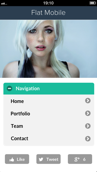
Flat Mobile Joomla! Template Launches
Friday, 31 May 2013 00:00

Flat design is a trend lately featured grandly by Google Now and Windows 8 (and Facebook), emphasizing solid colors, clean layouts and sharp typography, and leaving behind beveled edges, gradients, shadows and reflections.
We wanted to make it possible for also you to update your or your clients' websites to use a new, clean, 'flat' design look. So, ladies and gentlemen, please meet our latest template, now using flat design: Flat Mobile Joomla! template!
Designed as delicately as our previous Elegance Mobile Joomla! template, the Flat Mobile Joomla! template is based on JQuery Mobile Flat UI project.
Flat Mobile Joomla! template works seamlessly with our Mobile Joomla! Extensions, such as the Social Sharing Buttons Mobile and Google Maps Mobile.
Feature highlights:
- 7 different predefined color schemes
- 9 different AJAX animations for page transitions
- Open source, fully customizable using custom CSS and JavaScript
- App mode for full screen browsing on iPhone
- Compatibility with Joomla! 1.5, 1.6, 1.7, 2.5, 3.0, 3.1
Like all our premium products, when you buy Flat Mobile Joomla! template you also get access to our premium support forum and you will get 1 full year of product updates, new features and fixes.
(To give you some idea, since launching our Elegance template last year, we've released over 30 updates to it, including multiple new features and also new compatible extensions..!)
Screenshots


Extra Launch Offer: Get Extra 3 Months To Your Subscription
We will give 3 extra months as a bonus to your subscription time when you purchase any Mobile Joomla! premium product between June 1 - June 7.
Mobile Joomla! Club subscription offers now more value than ever: you get access to both the Elegance and Flat Mobile Joomla! templates, all Mobile Joomla! Pro features, as well as all of our 10+ Mobile Joomla! extensions.
You will automatically get the offer when you purchase within the campaign period. So go and get Mobile Joomla! Pro or Club, or opt for Elegance or the Flat Mobile Joomla! template.
Kunena Mobile Extension Now Supports Kunena 3.0 And CAPTCHA
Thursday, 23 May 2013 00:00
 Today's update to our Kunena Mobile extension for Elegance mobile template includes support for the brand new Kunena 3.0 release. (Kunena 3.0 includes, among other things, a major rewrite of their codebase and support for Joomla! 3.x.)
Other changes in the Kunena Mobile Extension are:
- Now there's support for CAPTCHA-protected posting on mobile
- Fixed one conflict with Kunena's JavaScript libraries
Lastly, our congrats to the Kunena team on the 3.0 release!
NEW: Mobile Social Share Buttons - Mobile Joomla! Module
Friday, 12 April 2013 00:00
Here's the latest addition to the Mobile Joomla! modules: JQuery-based Mobile Social Share Buttons module! This extension is available now for Mobile Joomla! premium users (Elegance, Pro, or Club users).
 Why did we build it? Most social sharing plugins and modules are quite heavy and slow to load on high-latency mobile connections. We wanted to offer something better.
So we built a lean new module, based on the SocialCount jQuery plugin by Filament Group Lab. The new module uses two or three small HTTP requests to the server (particularly, 1 for CSS style, 1 for JavaScript, and 1 optional request for counts) instead of a lot of requests to APIs of social networks. This improves the loading time considerably.
The new Mobile Joomla! social share module displays social sharing buttons for Facebook, Twitter and Google+, and supports all Mobile Joomla! templates (including Elegance in AJAX mode).
The module features these advanced settings:
- Select which social network buttons to display
- Hide/display social network icons on the button
- Set button size: small, medium, or large
- Display share counts
- Use Like or Recommend action for Facebook
- Set Twitter share text
- Load jQuery library (can be disabled if your template or other extension loads it)
Download the Mobile Social Share Buttons module now!
Mobile Joomla! 1.2.5 and Mobile Joomla! Pro 1.2.7 released
Thursday, 21 March 2013 00:00
Hey all, today brings an update to Mobile Joomla! standard and Pro versions.
The latest releases fix two issues in Mobile Joomla's Extensions Manager:
- Incorrect functionality in desktop mode
- Incorrect functionality in the case of two modules with identical titles
In addition, this update fixes some issues with displaying of embedded large-width videos. Now they will be shrunk to the screen size and will not break site design.
As always, you can update to the new version from your administrative panel via Mobile Joomla! Remote Update feature, or by downloading Mobile Joomla! package and installing it from the back-end. Do not forget to backup your website before the upgrade!
Remember to subscribe our RSS feed, follow us on Twitter and like our Facebook page to keep on top of all latest Mobile Joomla! news.
Mobile Joomla! 1.2.4 and Mobile Joomla! Pro 1.2.6 released
Thursday, 28 February 2013 20:19
New updates! We've just released Mobile Joomla! 1.2.4 and Mobile Joomla! Pro 1.2.6.
These releases include two main changes:
1. Support of RTL languages. Now both mobile_smartphone and mobile_iphone templates support right-to-left websites. If you know a friend developing RTL websites, spread the news!
2. Improved Mobile Menu module.
Do you use a special mobile menu, or would like to create one? Then this change is for you. As you know, the recommended way to create a mobile menu is to create it from “aliases” to corresponding desktop items (as this allows to keep menu item aliases). But in this case such a menu cannot contains subitems, because Joomla! doesn’t display subitems of “alias”-type items. So, in this Mobile Joomla! release we changed the Mobile Menu module to process such cases and display subitems as expected.
Other fixes:
- Fixed incorrect functioning of Mobile Joomla's module manager with "Force as homepage" feature
- Updated AMDD database (now supports BlackBerry 10 devices!)
- Fixed ScientiaMobile plugin problem in Joomla 3.0
Server Upgrade Completed!
Tuesday, 26 February 2013 00:00
 Hi all, over the past week we have been working to upgrade our server environment to manage our growing community (that's you!) better. Unfortunately, we encountered server issues in the beginning of last week when doing a software update. We faced problems due to MySQL update and our team needed to spend a good deal of last week working to restore our website stability.
We are happy to report that the issues seem to be resolved. Mobile Joomla! is now running on brand new hardware and updated server environment. We should be faster than ever, and this upgrade guarantees us the resources needed for further growth and allows us to focus on further improving our product this year.
In any case, if you happen to notice any issues with our website or your Mobile Joomla! user data, please contact us at /customersupport at mobilejoomla.com/ and we'll help you out.
We would like note that our service downtime last week should not have affected your mobile websites running Mobile Joomla!. Those parts of our product which have an online component, like the support ads module and Mobile Joomla! Pro online device database, have been designed to gracefully revert to offline mode in case of connection issues. Mobile Joomla! Pro especially includes caching and offline device database for this reason.
Apologies for the issues and the occasional inability to access your MJ account. Thanks for your support and understanding - we look forward to growing bigger and better with you this year!
More Articles...
- Improved Mobile Joomla! Mobile Device Support And New Releases
- Mobile Joomla! 2012 In Retrospect And Outlook For 2013
- New Mobile Joomla! Updates
- Responsive Design vs Server Side solutions (Infographic)
- Testing Mobile Websites With Browshot
- Mobile Joomla! Pro and Elegance Mobile Joomla! Template 1.2.1 Released
- Responsive Design Vs. Server-Side Solutions With Mobile Joomla! And BraveNewCode (Podcast)
- Mobile Joomla! Recommends SiteGround Hosting
Page 7 of 17
«StartPrev12345678910NextEnd»