Mobile Joomla! 1.2 with Joomla! 3.0 Support
Wednesday, 10 October 2012 00:00
 We just released Mobile Joomla! 1.2, Mobile Joomla! Pro 1.2 and updates to our mobile extensions. Updates mean a lot of new and exciting features:
Joomla! 3.0 Support
Joomla! 3.0 was released recently with a lot of new features, and one of them is support of Bootstrap CSS framework. Using this framework it’s possible to create web UI that adapts different screen sizes (like responsive templates). Joomla! 3.0 includes two such templates: protostar for frontend and isis for backend.
If you read our article about Responsive Templates with Mobile Joomla!, you probably noticed that sooner or later, having a pure client-side website layout adaptation will not satisfy those who look for a better than great mobile user experience. Mobile Joomla! can also be used to truly optimize your Joomla! website performance on mobile, regardless of the Joomla! version you use. With Joomla! 3.0, in addition, we look forward to more standardized extension development guidelines, which hopefully will make it easier to support a wider variety of extensions on mobile, something that has been quite time consuming until now.
To quickly sum up, using Mobile Joomla! with Joomla! 3.0 and responsive templates means following benefits;
- Significantly lower page sizes: Mobile Joomla! will serve the best possible images for a mobile device, which means significantly less data, faster page loading times and eventually more visiting time on site, more pageviews, and lower bounce rate. For advanced users, "retina" or HiDef images are also supported by Mobile Joomla Pro without any additional JavaScript-based solutions.
- Custom mobile homepage: Easily serve a custom page for your mobile visitors, increase your conversions and avoid problems with extensions that are not mobile friendly.
- Custom mobile title: With Mobile Joomla! you can set a custom title on mobile. This means better SEO, as well as handy for those who'd like to add your site on their home screen or bookmarks.
- Built-in mobile testing: With Mobile Joomla Pro you can use built-in simulators to test your site design on Samsung Galaxy Note, iPhone 4, iPad, Nokia 3510i and NEC N341i.
Note: JComments Mobile Joomla! Extension and Kunena Mobile Joomla! Extension don't work with Joomla 3.0, as the parent extensions are not Joomla 3.0 compatible as of now.
Extensions Manager
One of the reasons Joomla! is very popular is likely because of its simplicity and versatile extensions. Currently there are more than 10,000 extensions in the Joomla! Extensions Directory. Some of these extensions work well in mobile browsers, some require minor changes in CSS to make them look nice, but at the same time there are many extensions that work well on desktop only. And most of such extensions are just simple content sharing buttons, lightboxes, etc.
With Mobile Joomla, it's very easy to exclude some modules from the mobile template since mobile templates have another set of module positions. But what to do if this extension is a plugin that is run on every page? Or what to do if you use a responsive template, and the same modules are displayed in both the desktop and the mobile versions? Or you would like to display a QR code on desktop, but hide it on mobile?
They were tricky questions, but with this Mobile Joomla! release we have implemented a new feature that allows to disable modules and/or plugins on mobile pages.
Here's how it works:

Extensions Manager Menu
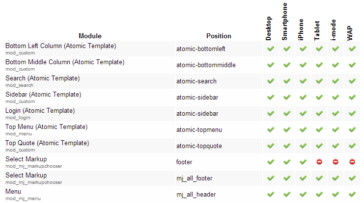
Extensions Manager view
Pretty neat, huh? We thought so as well.
There is one only limitation: it's impossible to disable plugins of the "system" and "mobile" groups. The plugins of the first group are loaded by Joomla! before Mobile Joomla! starts to work (and there is no way to "unload" them), and the latter ones are used to detect mobile devices by Mobile Joomla! itself.
Auto Health Checkup a.k.a. "Please-don't-do-it-that-way"
This feature was a part of Mobile Joomla! Pro starting from its first release, but we found it so useful that we decided to add it to the Mobile Joomla! as well, so that everyone can benefit. The feature includes testing of most common setup mistakes done by users, like assigning a mobile template to a menu item, having menu items with identical aliases (possible in Joomla! 1.5), forcing mobile mode in cookies, etc. We believe this will safe a lot of our newer users from frustrating errors, and make sure even experienced ones don't make accidental mistakes.
Updated Mobile Device Database
In Mobile Joomla! 1.1 we introduced a new database, Advanced Mobile Device Database (AMDD). It is targeted towards those users who want to make sure they only have GPLv2-compatible files installed on their server. (The other device database plugin we offer during installation is TeraWURLF provided by
The AMDD update includes an improved detection code for faster detections, and an updated device list. As a result the database contains now more than 13,500 browsers, while keeping the database size in less than 3 Mb.
Mobile Joomla! Pro 1.2
Mobile Joomla! Pro 1.2 contains all changes in Mobile Joomla 1.2 and some other fixes that our Pro subscribers can find on the Release Notes page.
Elegance Mobile Joomla! Template 1.2
Elegance Mobile Joomla! Template has been updated to use the latest jQueryMobile 1.2, which works faster and is more stable than jQueryMobile 1.1. It also contains some additional features, one of which is "popup" elements. That now works with Elegance template as well, see below:
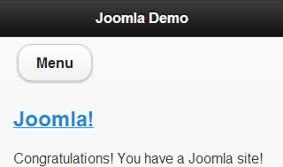
A mobile site front page view with a Menu button
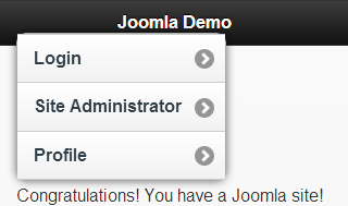
Popup element after tapping the Menu button
To transform your module into such an element, just set it to use the "popup" style (read more in Elegance documentation).
Full list of Elegance fixes/changes can be found on Release Notes page.
Other Mobile Joomla! Extensions
Following extensions have been updated, together with 1.2 release: Google Analytics Mobile, Adsense Mobile, Youtube Mobile, Mobile Content, and Remove Support Ads .
BrowserStack: Web-Based Cross Browser Testing
Friday, 05 October 2012 16:25
Note: this is Part V of our 8 part series introducing desktop tools for testing mobile sites.
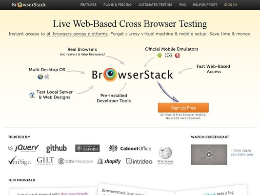 BrowserStack is a web service that offers a complete range of browsers for cross browser testing. The service is available online instantly without any downloads or installs.
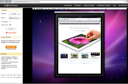
While the service started with desktop browsers, it now also includes official mobile emulators of iOS, Android, and Opera Mobile, so you can test how the sites work on iPhone, iPad, various Android devices, plus some others that support Opera Mobile (see full device list). BrowserStack also features advanced functionality like local tunnel testing of private sites and pre-installed debugging tools.
Works on: Windows, Mac OS X (Linux coming soon)
Requirements: You don’t need to install anything, just need a browser and Flash.
Price: Free trial for the first 30 minutes of testing. Then starts from $19/month for an individual user, up to $169/month for 25 users.
 Pros
Pros
- Instant access to iOS, Android, and Opera Mobile emulators (+ all major desktop browsers)
- No installation required
- Advanced developer tools
Cons
- Limited amount of different mobile devices available
- Needs a good block of available memory to run
Do you have your own tips or comments, or have we missed something? Let us know in the comments below!
Using DeviceAnywhere For Desktop Mobile Testing
Monday, 01 October 2012 00:00
Note: this is Part IV of our 8 part series introducing desktop tools for testing mobile sites.
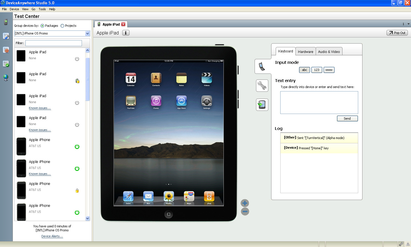 Keynote DeviceAnywhere provides testing access to a huge variety of mobile devices. The specialty of the service is that they actually make use of remote connection to real devices – so it's the real thing you are testing against, and not just an emulator. DeviceAnywhere's service can be used for testing of mobile websites as well as HTML5 hybrid apps and native apps. The service is a bit skewed towards testing apps, though.
Works on: Windows, Linux, Mac OS X
Requirements: To test your mobile site with DeviceAnywhere, you need to sign up for an account. After you have obtained an account, you can download and install their software.
Price: There’s a three-hour free trial with a limited selection of devices. Additional testing prices start from about $20 per hour up to $250 monthly subscriptions.
Pros
- Easy to use.
- Great device selection.
- Test using real devices.
- Lots of advanced functionality available for automating tests etc.
Cons
- Can get costly if you’re on limited budget.
- Clunky/slow Java UI.
- Since they use real devices, those may sometimes be broken or unavailable.
- The test phones only have U.S. operator networks available currently.
Do you have your own tips or comments, or have we missed something? Let us know in the comments below!
Mobile Emulators from Device Manufacturers (OEM)
Thursday, 20 September 2012 16:46
Note: this is Part III of our 8 part series introducing desktop browser tools for testing mobile sites.
Device Manufacturers, or OEMs, typically provide desktop emulators of their platforms. Often these are aimed more toward native application development, but they can also be used for mobile website testing. Typically the emulator provided by the device manufacturer or OS provider is the closest-matching alternative to real device testing, although it’s not always the case. In the following we will present some of these manufacturer tools.
Safari Developer Tools - iPhone/iPod/iPad
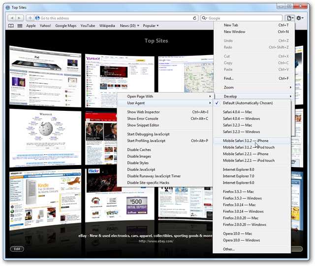 Ok, we will start with this even though it's not really an emulator - but provided by Apple nevertheless. The Safari browser can be used to test out mobile website by changing the browser's User Agent string. Safari developer tools enable modifying, debugging, and optimizing (mobile) websites. Apple naturally has also SDK and emulator for native app development.
Works on: Windows, Mac OS X, Linux
Price: Free
Requirements: Install Safari browser on your desktop and enable Develop menu in the Advanced tab of preferences. (See a detailed tutorial as needed.)
Pros
- Simple to install and use
- Comes with Web Inspector, Error Console, JavaScript Debugger and Profiler
- Convenient user agent switching
Cons
- You will need to manually import other, non-Apple mobile user agent strings
Extra mention: There are also some (typically quite simple and possibly not-so-accurate) device-specific 3rd party solutions like iPad Peek, iPad Emulator, and iPhone4Simulator.com.
BlackBerry Simulators
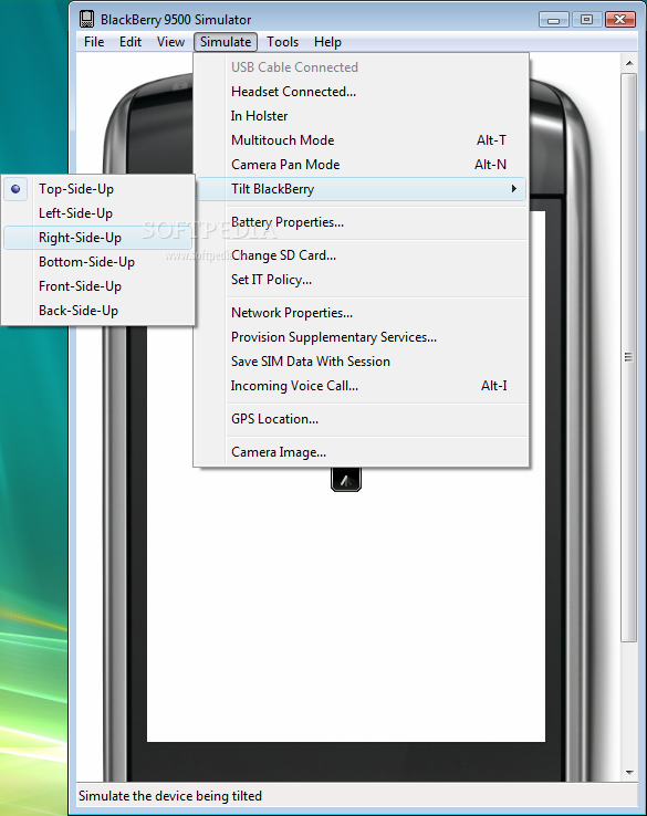 BlackBerry simulators are provided by RIM for web developers to do BlackBerry compatibility testing on various devices. There’s support for keyboard, and trackpad/trackwheel/trackball input. The tools also allow running and debugging BlackBerry applications on desktop computers.
Works on: Windows, Linux and Mac OS X
Price: Free
Requirements: VMware Player on Windows or VMware Fusion on Mac needs to be installed.
Pros
- Most of the typical device functionalities, even advanced like push notifications, can be tested. Very close to real device.
Cons
- Complex SDK, so there may be installation and other issues if you’re unlucky, and if you only want to test the browser, installing whole SDK is redundant.
Windows Phone Developer Tools
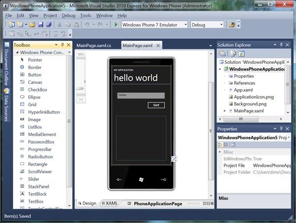 Windows Phone Emulator is a desktop tool to emulate Windows Phone 7 and up. Installation gives you a mobile environment where you can test, view, and debug Windows Phone apps and use the browser to check websites.
Works on: Windows 7 32-bit, Windows 7 64-bit, Windows Vista SP2 32-bit, Windows Vista 64-bit (XP not supported nor virtual machines)
Price: Free
Requirements: You need to download and install Windows Phone Developer Tools
Pros
Full-blown SDK with device emulator; allows for in-depth developer access to e.g. check on device peripherals, processor speed, RAM, display resolution and GPU • Lots of language versions available
Cons
- Only works on Windows
- Heavy and complex SDK with lots of requirements
- Some complaints about slow performance
Android SDK Emulator
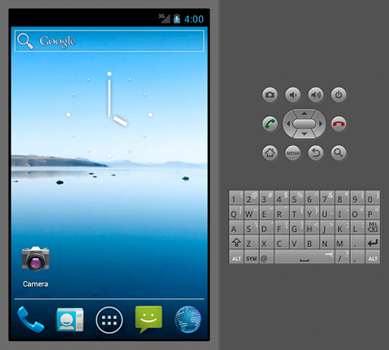 Android SDK and included emulator enables you to create a virtual mobile device on which you can run Android applications and test mobile websites. It has Android system stack and includes preinstalled applications that you can access. You can find the emulator inside Android SDK package.
Works on: Windows, Mac OS X, Linux
Price: Free
Requirements: You need to download and install the Android SDK before you can launch Android Emulator to run the browser to test your site. It is recommended that you use Eclipse Classic version, or a Java or Eclipse RCP version for running the Android SDK. Before doing this, make sure that you also have Java SE Development Kit (JDK) installed on your computer. In order to use the emulator, you must also create one or more Android Virtual Device configurations where in each of them you must specify which platform to run, which hardware to use and which emulator skin is your choice. You can also run Firefox Mobile on top of the Android SDK.
Pros
- Full-blown SDK with device emulator; allows for in-depth developer access to e.g. telephony, SMS, and SD card emulation, Geo location, extensive logging capabilities. Very close to real device.
Cons
- Complex SDK with lots to install. Lots of unnecessary stuff if you just need the browser to test mobile websites.
- The Android SDK is quite slow – it might be better to use an image from android-x86.org in VirtualBox (+more tips)
Do you have your own tips or comments, or have we missed something? Let us know in the comments below!
Firefox Mobile Developer Tools
Tuesday, 18 September 2012 00:00
Note: this is Part II of our 8 part series introducing desktop browser tools for testing mobile sites.
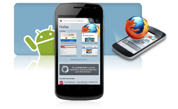 While Firefox has been one of the most popular Internet browsers, the Firefox mobile browser (codename “Fennec”) hasn’t been around for too long. Firefox and the Mozilla developer community provide a package of mobile developer tools along with useful browser add-ons for both users and web developers. The mobile browser Fennec can also be installed on desktops for testing. However, for most users it's probably easiest to install a few plugins to the Firefox desktop browser in order to preview and test mobile sites.
The latest Firefox 15 also has a built-in tool for testing web sites with various resolutions, under Tools->Web developer->Responsive Design View. Note that this view only changes the resolution of the browser, and not the User Agent of the browser for those websites that use server-side device detection (see our introduction to this mobile site testing article series for more info). However, when you have User Agent Switcher plugin installed this feature can be very handy, as you can just switch to the user agent of the target device and easily set the Firefox resolution accordingly.
Update Sep-19: Firefox 16 Beta apparently also has command line access to developer tools.
Works on: Windows, Linux, Mac OS X
Price: Free
Requirements: For Firefox desktop web browser, you need to get some Firefox add-ons also, at least User Agent Switcher. Optionally you maybe also want to get Modify Headers, and XHTML mobile profile. You also need the User Agent strings for the mobile devices you want to test -- easiest way is to get a big bunch in the same XML and just directly import the file to User Agent Switcher (In Firefox, select Tools->Default User Agent->Edit User Agents->Import).
For using the Fennec desktop version you should check the instructions and setup the Android SDK according to the Fennec Android guide. It is also possible to build a desktop executable version of Fennec from the latest source.
Pros
- Firefox desktop plugins are simple to install and fast to launch and use. No SDK to be installed.
- Fennec has keyboard, mouse, and pinch zoom support.
- Ability to sync bookmarks between the Fennec desktop emulator and normal Firefox browser can be handy for testing.
Cons
- Fennec doesn’t declare itself clearly as mobile browser, so many sites may not recognize it as one. In those cases you’ll need to use desktop Firefox and user agent changer.
- Installing and using Android SDK for Fennec is cumbersome if you don’t need the SDK for anything else. Also building Fennec from source code for desktop is a turnoff for casual users.
- Like Opera, it is just one browser - there might be variations with e.g. vendor-prefixed CSS properties etc.
BONUS NOTE FOR CHROME:
You can also find similar features in Google Chrome: Right-click on any page, select Inspect Element to open the Web Inspector, and then click on the “settings” icon in the bottom right corner of the Web Inspector. There you can set a different User Agent, screen size, and also so called “font-scale factor." You can also get User Agent Switchers for Chrome.
Do you have your own tips or comments, or have we missed something? Let us know in the comments below!
Mobile Joomla! Showcase: Webfor Web Design & SEO
Monday, 17 September 2012 00:00
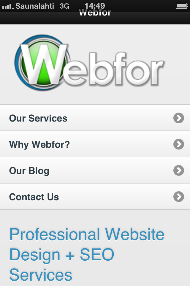 Webfor is a Web Design and SEO company that helps businesses succeed in marketing their business online. Their buzzwords are Website Design Awesomeness, Local SEO, Social Media, Email, and Paid Search. Webfor is based in Vancouver, Washington, USA. The company works by a motto of 3R’s: Relationship, Results, and Return of investment to increase and improve clients’ website traffic, market share, sales, and ROI.
 We had a chat with Kevin Getch, the President & Lead SEO of Webfor, a man admittedly being obsessed about SEO and SoLoMo (convergence of Social, Local, and Mobile). Read on for the interview.
Mobile Joomla! (MJ): What problem were you facing that Mobile Joomla! solved?
Kevin: Joomla! didn't have a lot of great mobile extensions. Mobile Joomla! is the best mobile extension for Joomla! by far. We've done sites both using the standard Mobile Joomla! template and the Elegance template. 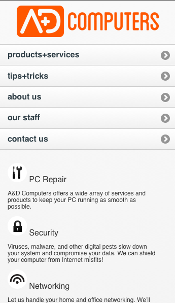 A couple of sites where we used the Elegance template for example are a-n-dcomputers.com and meticulousplumbing.com (plus webfor.com of course).
MJ: How much time or money has Mobile Joomla! saved you?
Kevin: Mobile Joomla! has easily saved us $1,000 in development, implementation, research, and education costs.
MJ: Has Mobile Joomla! increased your income?
Kevin: As mobile is a huge avenue for our clients we recommend a mobile solution to almost all of our potential clients. So yes, it has increased our income and our customer base as well.
MJ: What do you like most about Mobile Joomla!?
Kevin: What we love the most about Mobile Joomla! is the ease of implementation and the sleek and easy-to-customize design. Working with Mobile Joomla! has been a great experience. The team is very responsive when we have questions, but the best thing is we rarely need help when using Mobile Joomla! as it's very intuitive.
MJ: Was there something you found remarkable about Mobile Joomla!?
Kevin: The time it took to get a mobile site running! It took us about 10 minutes to set everything up.
Thanks Kevin for the interview!
You can reach/follow Kevin at @KevinGetch and @Webfor and Webfor Facebook
Opera Mobile Emulator For Desktop
Friday, 14 September 2012 00:00
Note: this is Part I of our 8 part series introducing desktop browser tools for testing mobile websites.
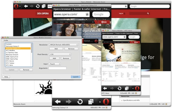 Opera Mobile Emulator is software created by Opera for web developers and designers to test websites on the Opera Mobile browser. It has the exactly same engine and UI as Opera Mobile on mobile phones. There are, however, some extra debugging tools available, such as keyboard shortcuts, the profile selector, and various command-line flags. Check out detailed description on the use of Opera Mobile Emulator.
Works on: Windows, Linux, Mac OS X
Price: Free
Requirements: Just a download from the Opera site.
Pros
- It’s an emulator, so you don’t need any real phones for testing. It comes pre-configured with a series of phone and tablet device profiles (User Agent strings). There’s also an online and downloadable Opera Mini Simulator for feature phones that run the Java-based Opera browser.
- Customizable User Agents - Users can freely change the UA string
- Super simple to install and easy to use. No need to install any complex SDKs or the like.
- Various input modes - There are three input modes available: touch, keypad and tablet. All modes can be activated and controlled by links and controls.
- Bookmark sync - Opera Mobile Emulator can be integrated with Opera Turbo and Opera Link to enable bookmark sync for faster testing.
- Optional: Remote debugging with real devices - you can do remote debugging by installing also Opera Dragonfly that contains useful features such as DOM, CSS, Network Inspectors, JavaScript Debugger, Command Line and Error Console.
Cons
- Media support may not be perfect.
- By default, only User Agent Strings for the platforms Opera Mobile runs on are included. However, it's possible to add iPhone User Agent to Opera Mobile Emulator as a custom UA string.
- The emulator displays how pages look using the Opera mobile browser -- as known, not all features work similarly in different browsers. Even more so in the mobile world.
Do you have your own tips or comments, or have we missed something? Let us know in the comments below!
8 Ways To Test A Mobile Site on Different Mobile Devices
Friday, 14 September 2012 00:00
Update: See the new updated version at How To Test Mobile Websites On Desktop
How to test mobile websites with different mobile phones is a question we get quite often. It can be a tricky task indeed to try to verify that your mobile website looks the way it should on all the devices out there. 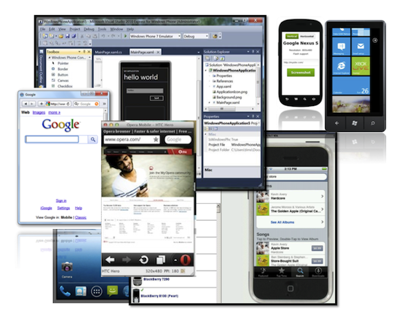 Even if you aim to be selective, you probably want to support iPhone, Android, Windows Phone, BlackBerry, and some semi-smartphones, and it's still a big bunch to test. And perhaps you should also consider feature phones, which still make up 50%+ of the total market. Whatever the case, manual testing can be very time consuming – and costly, if you were to purchase all key devices. In this blog series we will take a look at various different online and desktop services that can used for testing how mobile websites work on different devices.
For our Mobile Joomla! Pro users we’ve tried to make it as easy as possible to do basic testing to see how the site looks on various devices. Mobile Joomla! Pro includes back-end device simulators with which one can easily try out how the chosen settings affect the Joomla! site on the iPhone, Android/smartphones, and features phones. While it may not completely remove the need to test advanced features with a large variety of devices, our aim has been to make it fast and easy for professional users to make adjustments to their mobile site while seeing the results at the same time.
Before we get started, it is important to understand that there are different ways to detect mobile devices. The detection can be done on the client-side (browser) and/or server-side, and these approaches have certain major differences. When you want to see how a site would look on a certain mobile phone model (without using the real device), your best bet for accurate results is to mimic the so called User Agent of the device. When you download a web page, your browser sends a User Agent string (UA) to the server. The string identifies the device and the browser, and this way it’s possible for the web server to detect and identify the browser as e.g. a Chrome desktop browser, a Safari browser on an iPhone, or as the native browser of a particular Android device. The server can then serve different content depending on the device (if the site is built that way - vast majority of the biggest sites are using server-side handset detection). In many cases this is the reason why simply resizing your desktop browser window may not give an accurate match of how the site would look like on a certain device. With some tools, however, it is possible to change your desktop browser’s UA string to match that of a different device for testing. We'll cover that in this series as well.
On to the series:
Part I - Opera Mobile Emulator For Desktop
Part II - Firefox Mobile Developer Tools
Part III - Mobile Emulators from Device Manufacturers
Part IV - Using DeviceAnywhere For Desktop Mobile Testing
Part V - BrowserStack: Web-Based Cross Browser Testing
Part VI - Testing Mobile Websites With Browshot
Part VII (coming up)
Part VIII (coming up)
Do you have your own tips or comments, or have we missed something? Let us know in the comments below!
More Articles...
- Mobile Joomla! 1.1.1 Released
- Mobile Joomla! Pro 1.1.2 Released
- 400% Faster Responsive Joomla! Templates with Mobile Joomla!
- Supercharge Your Mobile Site: Mobile Joomla! Pro & Mobile Joomla! Club Are Here!
- Mobile Joomla! Pro Crazy Launch Specials & Contest
- Google Maps for Mobile Joomla! & Extension updates
- Elegance Mobile Joomla! Template 1.1 Update
- Introducing Mobile Joomla! Pro
Page 9 of 17
«StartPrev12345678910NextEnd»

