400% Faster Responsive Joomla! Templates with Mobile Joomla!
Tuesday, 14 August 2012 17:07

We all know and love how responsive templates mean fast and easy "mobile-ready" display for your Joomla! site. However, have you also heard of the shortcomings of responsive templates? Bad news - there are some. Good news - there is an easy solution for the Joomla! community. Read on!
First, let's take a look at the two major approaches to display websites on mobile devices: Client-side and server-side solutions.
Client-side solutions
Responsive templates are client side solutions, which are designed to adapt their look and content across devices, and based on the browser capabilities they are viewed. This means a single source template can deliver a consistent and good looking experience on a wide range of devices, such as smartphones & tablets. However, as described, responsive templates 'adapt', they are 'single source' and 'client-side'. In practice this means that when your visitors view your website on an iPhone, they download assets of all other devices (i.e desktops, and tablets) as well and images are downloaded in original (desktop) size and just adjusted. This usually results in several megabytes of data and hundreds of HTTP requests, and means a lot of unnecessary data usage, time and battery loss for your visitors. This may not seem a lot for a desktop visitor on a broadband, however it does matter for a mobile visitor on 3G who needs to wait 20 or more seconds for a single megabyte to download.
Server-side solutions
Server side solutions, on the other hand, can detect your visitors' device and send only the required and suitable assets. This means, everything can be known and optimized, before they are delivered to a visitor's browser. Surely, this approach needs much detailed thinking, design and implementation, and is usually more costly than other alternatives. However, if you are serious about your business and want to minimize visitor bounces and maximize their time on site, it is definitely worth the investment.

RESS
Towards late 2011, a hybrid solution was suggested to bring advantages of two worlds together and eliminate disadvantages, called RESS (Responsive Web Design + Server Side Components). RESS is neither a pure client, nor a pure server-side solution. In a nutshell, RESS optimizes certain assets of responsive templates on the server-side, so that they work and perform better on mobile devices. So, if you could somehow turn your responsive template into RESS, you could help your mobile visitors save loads of data, time, and battery life. Well, luckily, you are using Joomla!
Mobile Joomla! turns responsive Joomla! templates into RESS
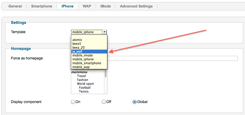
Mobile Joomla! is a server-side solution, by which you can finely optimize your Joomla! website's look, modules, plugins, URL, media, and other assets on various mobile devices (i.e., iPhone, Android, iPad, etc.) with ease. As a not very widely known fact, any responsive Joomla! template could be turned into RESS when used with Mobile Joomla! That's as simple as installing Mobile Joomla! and selecting your responsive template for each device category, and voila! In a couple of minutes, and without any cost, you have a RESS mobilization solution for your Joomla! site!
Mobile Joomla! Responsive Template Analyzer™
We built Mobile Joomla! Responsive Template Analyzer to test responsive template performances with Mobile Joomla! The tool turned out really great and we decided to release it for everyone to benefit! Now you can test your Joomla! website and see the performance boost you could get by turning your template into RESS using Mobile Joomla! The tool simply analyzes your website assets and tries to estimate what kind of performance increase you would achieve. We say "tries to estimate," since there are many variables and it's not possible to know exact figures until you install and use Mobile Joomla! on your site.
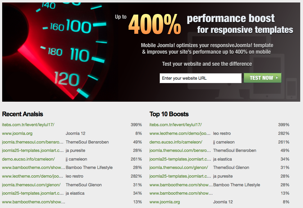
We tested some of the most popular responsive Joomla! templates out there, and saw that some Joomla! websites would perform 400% faster on mobile devices, if they were using Mobile Joomla!
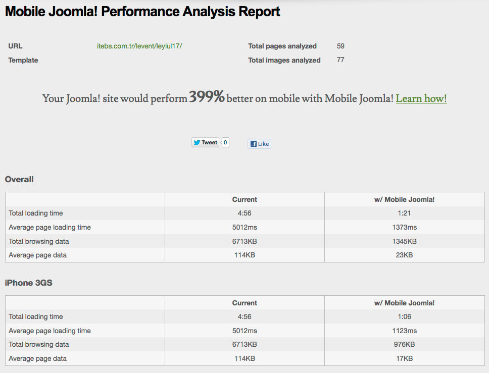
Now go ahead and test your website with Mobile Joomla! Responsive Template Analyzer and check the Analyzer report to see the potential performance boost you could get. Then download Mobile Joomla!, install and improve your responsive Joomla! template performance on mobile devices for real, for free. If you are happy with the results, just recommend others the same and support us.
If you have any further questions or comments, let us know below!
Further Reading on RESS
http://www.lukew.com/ff/entry.asp?1392
http://www.netmagazine.com/tutorials/getting-started-ress
http://www.slideshare.net/4nd3rsen/ress-responsive-design-server-side-components-10084972
Image by .net magazine


Comments
RSS feed for comments to this post