How to install a Mobile Joomla! Extension
Mobile Joomla! Extensions
With Mobile Joomla! Extensions, you can tailor your site to perfection and ensure the best results on mobile. We will see the core Mobile Joomla! extensions, and go through all the pre-installed extensions. Then we will take a closer look at the Kunena Mobile extension. We also discuss the JComments and Mobile Ads extensions.
How to Install a Mobile Joomla! Extension
Installing a Mobile Joomla! extension is not much different from installing a desktop Joomla! extension:
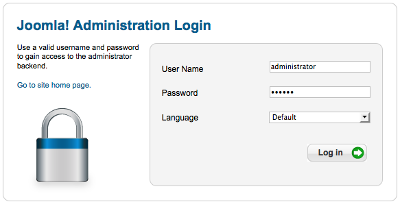
- Login to your site backend from the Administration panel
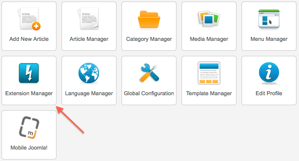
- Go to Extension Manager
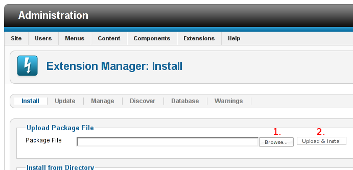
Browse the correct extension file
Click Upload & Install
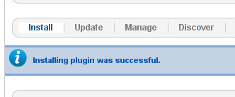
- If you see success message continue. Otherwise, please fix the error or search/ask for help at the Mobile Joomla! forums.
- Go to Joomla! extension manager and find the extension.
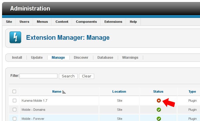
- Enable the plugin
Overview of The Core Extensions
Next, let’s review on the core extensions of Mobile Joomla!:
Mobile Joomla Plugin
This plugin must run first and it is the main Mobile Joomla! component. It recognises the browser using other plugins. It decides which template is required for a particular client browser and optionally changes Joomla!’s homepage menu item. If this plugin is disabled then Mobile Joomla! is turned off and will not work on the site.
Mobile - Simple Plugin
This plugin does exactly what the name hints: it recognizes the most common browsers, but it may fail in some cases. Thus it’s not the main detection method used by Mobile Joomla!.
The plugin just checks for the “User-Agent” HTTP header for known iPhones, iPods, iPads (if enabled in settings) and the i-mode headers to detect iPhone and i-mode correspondingly. If this check fails, then the plugin checks for the “Accept” header to check if the phone supports html format. If that is the case, Smartphone mode will be used, otherwise WAP mode. Unfortunately, this plugin cannot determine the screen resolution correctly for some devices. Mobile –Simple plugin recognizes most of modern tablets/smartphones, but it fails with some of ancient phones and even (though to less extent) with some modern phones.
Mobile – AMDD Plugin
This plugin uses the fast and compact Advanced Mobile Devices Database (AMDD) maintained by the Mobile Joomla! team. It is targeted towards those users who want a compact yet high-performing database, and/or want to make sure they only have GPLv2-compatible files installed on their server.
The AMDD plugin includes an advanced detection code for faster device detections, and a device database that contains currently more than 13,500 browsers. The database is extremely streamlined with the size being less than 3 Mb.
Mobile - Domain Plugin
This plugin detect the usage of mobile subdomains and changes the template accordingly. There are no special parameter, all the settings come from Global settings tab of Mobile Joomla! Settings page.
Mobile - Always Plugin
This plugin forces the use of the mobile template and is used for two purposes:
1) to debug the mobile site with any browser or tool;
2) the site is developed to be used with certain type of mobile devices only.
There is one only parameter in the plugin, Mobile markup, with the following possible values: Auto (default), mobile, tablet. The description of the device types was explained in the section 1.4 Device Types.
Proxy Position
Most likely your desktop template and Mobile Joomla!’s template have different module position names (e.g. desktop template would have ‘banner’, ‘header’, ‘sidebar’, ‘footer’, and Mobile Basic template has ‘mj_top’, ‘mj_middle’, ‘mj_footer’, ‘mj_panel’). And if you like to display desktop position in mobile template, use Proxy Position module. This module renders a module position in the place where this module is published. For example, you can publish this module in ‘mj_top’ position and set it to display ‘sidebar’ position from desktop template. As a result, there is no need to create a duplicate of desktop modules to display in mobile template.
Proxy Module
This module works in a similar way to Proxy Position module, but displays just one module only. It may be necessary if there is no reason to display all desktop modules in mobile template, but few of them only.
Mobile Switcher
This module allows switching between desktop and mobile versions of the site. Mobile Joomla! installs two instances of the module: first in mj_footer position for mobile templates, and second in footer position for desktop template (to switch back to mobile version). But unfortunately a lot of templates have no footer position, so you should change it to one of the existing positions.
Mobile Joomla! CPanel Icon Module & Plugin
This backend module is used for a fast access to Mobile Joomla! Settings page and to update Mobile Joomla! when the update is available. The module is used in Joomla! 1.5, 1.6, and 1.7. In Joomla! 2.5 and 3.x a native plugin (Quickicon - Mobile Joomla! CPanel Icon) is used instead.
Mobile Templates
Mobile Joomla! includes Mobile_Basic template. But you can also use any other mobile templates (including a responsive template) or create your own unique one.
Tips: The installed templates are not usual Joomla! templates. They may be run through Mobile Joomla Plugin only. That is why you cannot assign them to menu items (in this case you get “Incorrect usage of Mobile Joomla!” message).
Additional Extensions
Now that we have seen the core extensions, let’s take a look at the additional extensions of Mobile Joomla!.
YouTube Mobile
This plugin replaces Youtube movies with a thumb that links to watch the movie on Youtube.
Mobile Content
Mobile Content plugin allows you to show different content for different mobile devices. The plugin requires Mobile Joomla component to be installed.
There are two ways to use this plugin. The first one is very simple: you just frame certain content with
{mobile}...{/mobile}
Or
{desktop}...{/desktop}
quasi-tags for mobile and desktop site versions correspondingly.