Settings and configuration
Basic Settings & Configurations
We have installed Mobile Joomla! successfully. Now we will see the basic configuration options of it. We’ll discuss the options step by step in below.
The Settings page allows you to tune Mobile Joomla! settings to fit your needs. Settings are split into several pages: General and Advanced for settings that are common for all types of devices, pages corresponding to supported mobile modes (Mobile and Tablet), Plugins and Modules to disable specific extensions in different modes, and finally, the Preview page to test devices.
Full information about each settings page can be found in corresponding chapters of this guide.
General Settings
First, let’s click the ‘General’ page. It will display the below options:
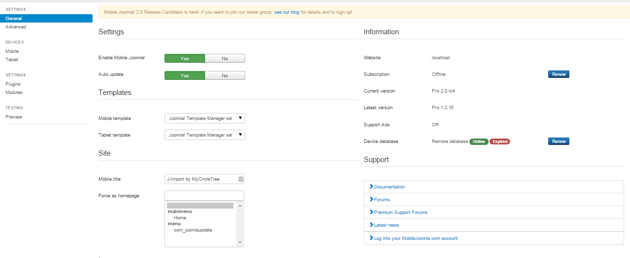
- Enable Mobile Joomla!: Enable or disable Mobile Joomla! Internally it just enables and disables Mobile Joomla! plugin.
- Auto update: Mobile Joomla! will be updated automatically. New releases will be checked once per day and installed in the background.
- Templates: Duplicates template settings from corresponding Devices pages. Selected templates will be displayed for Mobile visitors.
- Mobile title: We can overwrite the title of the mobile site here. Just write down the title in the text box.
- Force as homepage: Set this page as a homepage (e.g. index.php?option=com_content&view=article&id=12&Itemid=1). We choose a menu item from the select box. This will be displayed as homepage in mobile devices.
- Rescale images: Rescale images into optimal size based on device resolution. This will rescale the image, if the width of the original image is wider than screen width.
- Rescaling quality: We can set the quality of the rescaled JPEG image here. The range is between 0 to 100.
Advanced Settings
To go to the advanced configuration options, click the Advanced settings page. This will bring the below options. Let’s go through each of the options here.
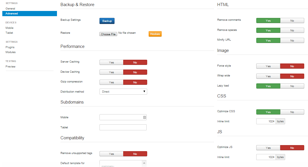
- Server Caching: By enabling this option, we use server caching to cache pages for mobile devices. This improves application performance a lot. Note that server caching may require much disk space because of each device type is cached separately.
- Device Caching: If we check this option as On, then pages will be cached in mobile device browsers for 15 minutes. Recommended for rarely updated websites without frontend authorization.
- Gzip Compression: We can compress the output of the pages by enabling the option.
- Distribution method: Distribution method of the compressed JS and CSS files to the client device. Different methods perform better on different server setup. Direct method distributes them in the standard method of the webserver (like any other files), but most likely then gzip compression and caching may be disabled. Apache mod_rewrite+mod_headers is the fastest method, but requires Apache with mod_rewrite+mod_headers modules enabled. Apache mod_rewrite and PHP are identical from the performance point of view; the only difference is that Apache mod_rewrite requires Apache, while PHP generates not-so-beautiful URLs like /media/mj/get.php?abcdef.js instead of just /media/mj/abcdef.js. Mobile Joomla! attempts to choose optimal method during installation.
- Subdomains for Mobile and Tablet (in Mobile Joomla! Pro): if we want to use subdomains for the different mobile visitors, then we will write the corresponding subdomain names in these fields. See the next section for more on how to setup subdomains.
- Remove unsupported tags: With this option selected, we can remove unsupported tags (object, embed, applet) from our pages in the mobile devices.
- Remove comments: Clean up page by removing comments from the HTML code for faster loading.
- Remove spaces: Removes empty spaces from the HTML code for faster loading.
- Minify URL: Replaces absolute URLs (http://www.website.com/link) into relative URLs (/link) to reduce page size. Disable if there is a conflict with another extension (e.g. which uses Javascript that requires all links to have a full domain name).
- Force style: We can add width and height to style attribute of the IMG HTML element. Useful in the case of conflict with 3rdparty css styles for sizing images.
- Wrap wide: Wrap images that are wider than half of the screen into a centered . This makes a floating (align=right or align=left attribute) image to fill full horizontal size if it's wider than 50% of the screen width (otherwise there is a narrow column of text near the image).
- Lazy load: Lazy load images with the Lazy Load XT script. Significantly speeds up the loading of image and/or video-heavy webpages.
- Optimize CSS: Optimizes CSS for better performance. Removes unnecessary whitespaces, unused code etc.
- Optimize JS: Optimizes Javascript for better performance. Removes unnecessary whitespaces, minifies the code etc.
- Inline limit: Inline limit allows to inline small CSS or JavaScript (up to the specified limit) into the page directly in order to avoid sending additional requests to the server (i.e. speeds up loading). 1024 bytes is likely optimal for most cases, allowing inlining of small files while not inlining large ones.
Mobile and Tablet Settings
We go to the Mobile settings page (Tablet settings page has the same set of settings). This page brings the below screen:
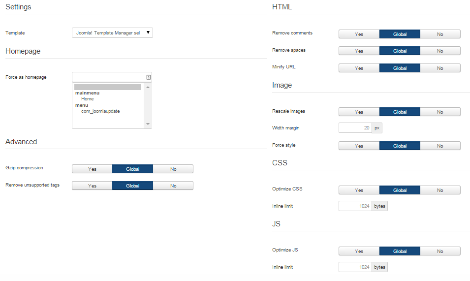
All presented settings override global settings in General and Advanced pages.
Plugins Settings
Some plugins might not be compatible with certain devices. That is why Mobile Joomla! provides a way to disable plugins for desktop, mobile devices, and tablets. The only exception is “system”-type plugins: Joomla loads and executes them automatically at initialization stage, before Mobile Joomla! code is executed.
Modules Settings
In a similar way, it’s possible to disable specified modules for desktop, mobile, and tablet devices.
Testing Preview
With the mobile device simulators included in the Mobile Joomla! backend you can check how your changes affect your site on the fly! Just click on the thumbnail image to display your mobile website on given device.
Please note that despite the simulators should be quite accurate, since they are by definition simulators and not real devices or emulators, there may be slight differences between the view of the Online Device Simulator and the real device.
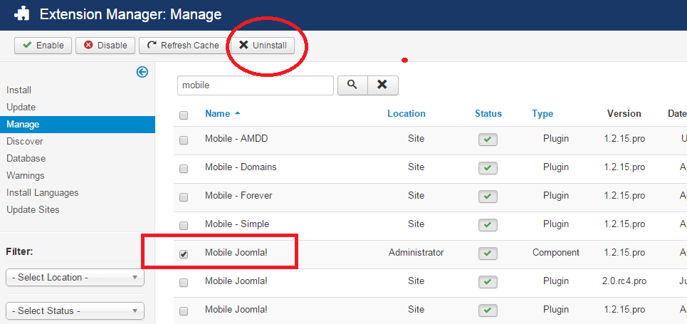
Uninstalling Mobile Joomla!
To uninstall Mobile Joomla! uninstall the Mobile Joomla! component in Joomla’s standard fashion. Note that the Mobile Joomla! settings will be lost if you uninstall it.
First, we go to Extensions->Extension Manager.
Then click the ‘Manage’. And search for Mobile Joomla!. Then click ‘Uninstall’.