8 Ways To Test A Mobile Site on Different Mobile Devices
Friday, 14 September 2012 00:00
Update: See the new updated version at How To Test Mobile Websites On Desktop
How to test mobile websites with different mobile phones is a question we get quite often. It can be a tricky task indeed to try to verify that your mobile website looks the way it should on all the devices out there. 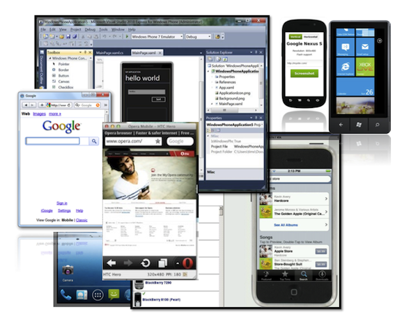 Even if you aim to be selective, you probably want to support iPhone, Android, Windows Phone, BlackBerry, and some semi-smartphones, and it's still a big bunch to test. And perhaps you should also consider feature phones, which still make up 50%+ of the total market. Whatever the case, manual testing can be very time consuming – and costly, if you were to purchase all key devices. In this blog series we will take a look at various different online and desktop services that can used for testing how mobile websites work on different devices.
For our Mobile Joomla! Pro users we’ve tried to make it as easy as possible to do basic testing to see how the site looks on various devices. Mobile Joomla! Pro includes back-end device simulators with which one can easily try out how the chosen settings affect the Joomla! site on the iPhone, Android/smartphones, and features phones. While it may not completely remove the need to test advanced features with a large variety of devices, our aim has been to make it fast and easy for professional users to make adjustments to their mobile site while seeing the results at the same time.
Before we get started, it is important to understand that there are different ways to detect mobile devices. The detection can be done on the client-side (browser) and/or server-side, and these approaches have certain major differences. When you want to see how a site would look on a certain mobile phone model (without using the real device), your best bet for accurate results is to mimic the so called User Agent of the device. When you download a web page, your browser sends a User Agent string (UA) to the server. The string identifies the device and the browser, and this way it’s possible for the web server to detect and identify the browser as e.g. a Chrome desktop browser, a Safari browser on an iPhone, or as the native browser of a particular Android device. The server can then serve different content depending on the device (if the site is built that way - vast majority of the biggest sites are using server-side handset detection). In many cases this is the reason why simply resizing your desktop browser window may not give an accurate match of how the site would look like on a certain device. With some tools, however, it is possible to change your desktop browser’s UA string to match that of a different device for testing. We'll cover that in this series as well.
On to the series:
Part I - Opera Mobile Emulator For Desktop
Part II - Firefox Mobile Developer Tools
Part III - Mobile Emulators from Device Manufacturers
Part IV - Using DeviceAnywhere For Desktop Mobile Testing
Part V - BrowserStack: Web-Based Cross Browser Testing
Part VI - Testing Mobile Websites With Browshot
Part VII (coming up)
Part VIII (coming up)
Do you have your own tips or comments, or have we missed something? Let us know in the comments below!


Comments
RSS feed for comments to this post