Mobile Joomla! 2.1.8 Released
Tuesday, 26 April 2016 00:00
Hi there, Mobile Joomla! 2.1.8 has been released!
What's new
Mobile Joomla! 2.1.5 Stable Release, changelog:
- Updated AMDD database (e.g. fixes the recognition of Google Pagespeed bots after Google changed their user agent strings)
- Improved performance with new powerful tweaks under the hood
- Fixed lazy image loading issues
- Fixed warnings in PHP 7
- Added jQuery 1.12.3 and 2.2.3 in Mobile_Basic template
As always, you can update to the new version from your administrative panel via the Mobile Joomla! Remote Update feature, or by downloading the Mobile Joomla! 2.1.8 package and installing it from the backend. Do not forget to backup your website before the upgrade!
Remember to subscribe to our RSS feed, follow us on Twitter and like our Facebook page to keep on top of all latest Mobile Joomla! news.
Mobile Joomla! 2.1.5 + Premium Template Updates Released
Monday, 14 March 2016 07:01
Hey all, Mobile Joomla! 2.1.5 has been released! Update is available for all versions (Community, Basic, Pro).
What's new
Mobile Joomla! 2.1.5 Stable Release, changelog:
- Fixed issue with sidebar panel
- Fixed issue with work of submit buttons in external 3rd party extensions
- Fixed issue with merging of Javascript files
- Fixed issues with update to new version from settings page
- Fixed Save confirmation popup in Joomla! 1.5
- Fixed displaying of expiration notices in Joomla! 1.5-2.5
- Fixed issues with "Fast optimizer" mode
- Fixed update from MJ versions previous to 2.1.1
- Added jQuery 1.12.1 and 2.2.1 in Mobile_Basic template
- Added Troubleshootings section in Mobile_Basic template's settings
- Updated AMDD database
- Updated self-test inspections
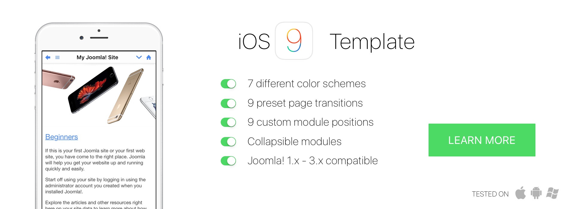
We have also released new versions of premium templates: Elegance 2.0.11, Flat 2.0.10, iOS9 1.0.5, and Square 1.0.4.
Changelog for the premium templates:
- Fixed loader animation in AJAX requests
- Fixed issue with sidebar panel
- Added latest jQuery versions (1.12.1 and 2.2.1)
- Added Troubleshootings section in settings
As always, you can update to the new version from your administrative panel via the Mobile Joomla! Remote Update feature, or by downloading the Mobile Joomla! 2.1.5 package and installing it from the backend. Do not forget to backup your website before the upgrade!
Remember to subscribe to our RSS feed, follow us on Twitter and like our Facebook page to keep on top of all latest Mobile Joomla! news.
Mobile Joomla! templates update: Elegance 2.0.8, Flat 2.0.8, iOS9 1.0.3, Square 1.0.2
Monday, 11 January 2016 10:59
We have just released new versions of our premium Mobile Joomla! templates:
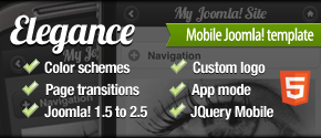
- Mobile Elegance 2.0.8
- Mobile Flat 2.0.8
- Mobile iOS9 1.0.3
- Mobile Square 1.0.2
with many updates and new features:
Adjustable buttons in the headerbar
- It's now possible to set the position (left/right) or hide each button in headerbar: Home, Back, Popup, Search, Login, Panel (position of the Panel button depends on the position of the Sidebar panel).
- Improved layout of the search popup.
Sidebar panel improvements
- Choose between left and right position of the sidebar panel.
- Use swipe gesture to open the sidebar panel.
Menu module layout
- Improved layout for nested menu items.
- Fixed highlighting of the active menu item.
- Fixed module layout in Joomla! 1.5.
jQuery 1.12 and 2.2
- All the premium templates include new versions of jQuery: 1.12 and 2.2. Altogether you can use jQuery 1.7, 1.8, 1.9, 1.10, 1.11, 1.12, 2.0, 2.1, 2.2. (There are many differences in 1.7-1.8-1.9-1.12-2.2, and there are old Joomla extensions that require jQuery 1.7 and don't work in 1.8+). Note that by default jQuery 1.9 is used (for better compatibility with external 3rd party extensions and ancient browsers), and you can switch to other jQuery version in settings of the template.
And more
- other minor bugfixes and improvements.
Introducing Mobile Joomla! 2.0
Wednesday, 25 November 2015 19:25
BIG News!
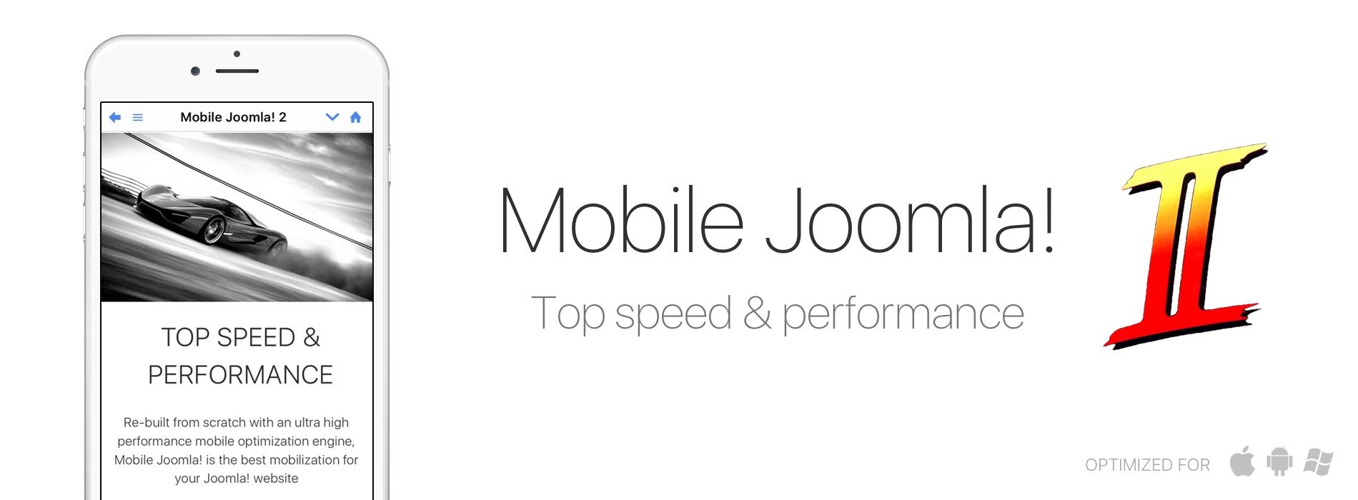
A year ago, we started working on the next generation of Mobile Joomla! We envisioned a new future and rebuilt everything from scratch with an ultra high performance mobile optimization engine, besides simpler setup and user interface.
Now, it’s time to unleash our hard work – Mobile Joomla! 2
Mobile Joomla! 2: UX Improvements
- Simpler setup, designed to work out-of-the-box
- Streamlined admin view, yet more extensive settings
- Greatly improved default mobile template
Mobile Joomla! 2 Performance Optimization Features (a.k.a. "Let's give that Google Pagespeed number a real boost!")
- Advanced image optimization for fastest loading times
- Javascript and CSS combination and minification
- Extended lazy loading of images and videos
- Server side removal of unnecessary code/scripts/CSS for fewer HTTP requests
- Automatic responsive script loading (like FastClick, FitVids, Add to Home, etc.) and viewport tag
- And much, much more
NEW mobile template for Joomla! – Square
We are also introducing today:
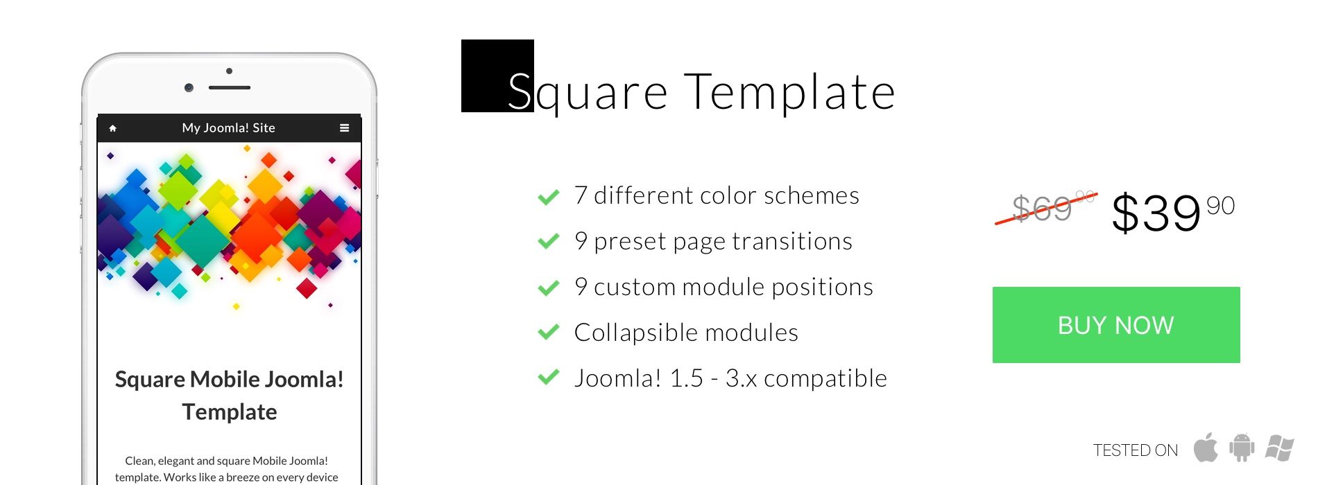
Square Mobile Joomla! Template
Now on launch sale for $39.90.
Buy Square Mobile Joomla! Template
Browse all Mobile Joomla! Templates
Enjoy!
If you have any questions, feel free to ask us at /support at mobilejoomla.com/ and we will help you out!
How To Test Mobile Websites On Desktop: Best Emulators And Tools
Sunday, 06 September 2015 12:10
Testing Your Mobile Site
How to test mobile websites on your desktop with different mobile devices is a question we get quite often. There's a huge amount of devices out there and you need to make sure your sites work fine for the majority of them.
As Google is placing a huge emphasis on mobile user experience – their latest algorithm update causing nearly 50% of non-mobile friendly URLs to drop in ranking, making it bigger than the "Panda" update – you can be sure that if your site's mobile visitors will not like the loading speed and what they see, they will leave, and that will affect your site's ranking.
We have collected in this post some of the best free and paid tools that you can use to test your mobile sites on your desktop on various devices without having to actually go and loan or purchase the devices.
Just keep in mind that whenever possible, it's always best to do sanity checks on the actual devices as well, if you have access to them somehow.
Important Note About Latency
The screen size is not all there is to mobile. Don't forget to play with the connection speed, which many of the tools allow you to change. It makes a HUGE difference to the website loading time if the mobile visitor is using a 3G or even 4G network.
The total "network overhead" time for mobile page loading on 3G is over 50%! That's spent without regard to your web server's or the client device's performance, just due to the mobile network latency.
The number of total roundtrips needed (number of HTTP requests) to load a page quickly add up. You won't even realize that if you only do your testing on fast DSL.
Background Preparations - Understanding Your Mobile Visitors
There's such a huge amount of devices out in the market that you need to focus your efforts. It's simply not productive to try to test with hundreds of different devices and browsers.
It would be best to start with analyzing your target audience, i.e. your website visitors. What are the main user groups in terms of demographics? What devices can you assume they use? Cheaper Android phones, or iPhones? Windows Phones? From which countries does the majority of your traffic come from?
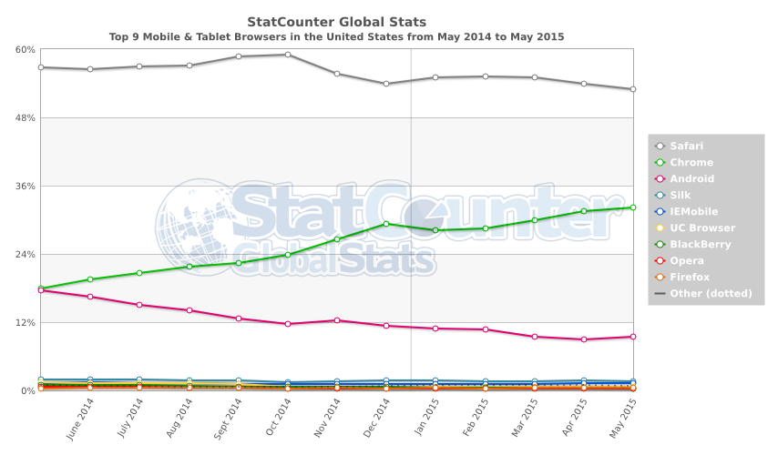
A good tool for checking high-level country-level stats is Statcounter's service, here's for example the graph for mobile and tablet OS market shares for the US:
You can and should check your existing traffic from Google Analytics. Go to your Reporting view, and select Audience->Mobile->Devices, and you will what your current visitors use. You probably will see a lot variations of the same devices and close cousins like Samsung GT-I9295 Galaxy S4 Active, Samsung GT-I9195L Galaxy S4 Mini, Samsung GT-I9195 Galaxy S4 Mini etc.
Realistically, you can check your Top 10 devices in more detail, and then combine different variants and include 10-20 more device profiles that you will check in less detail, to cover e.g. 80-90% of your mobile traffic. Naturally the scope depends on how much traffic the site gets.
So, with your top 10-30 devices identified, let's review some of the best ways to test your mobile websites:
Test on the Real Mobile Device
Yes, we promised to cover the various alternative tools, but let's just get this out of the way first.
Naturally, it is always best to test your website using the actual devices so that you can actually see what's really going on with your website. This way you are also able to see any possible bugs in the device software (firmware) which might cause (not-so-)funny outcomes. Also, if you use local caching, you may found out that it doesn't work the way intended if you haven't taken into account the mobile device's much smaller cache space available which fills up fast.
The user experience contains many factors like variable network conditions, pixel densities, the relative size of tap targets, and real page load times. In a perfect world, every website would be tested on every major mobile device that it might be viewed on.
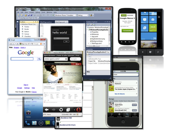
Online Emulators and Simulators
What's the difference between a simulator and an emulator? In many cases, the terms are used interchangeably. Both let you run the mobile device software in the desktop or browser environment.
Typically emulator specifically means that it works by duplicating every aspect of the original device's behavior down to the hardware. So it tries to mimic the real device use as closely as possible.
A simulator, on the other hand, sets up a similar environment to the original real device, but it doesn't attempt to simulate the actual real hardware. This may affect the results. Practically when we're talking about testing mobile websites, this doesn't necessarily make that much difference (but it might). Most of the (most convenient) tools available are simulators, while emulators typically are distributed as downloadable applications along with possible IDEs more targeted for app development.
Important: User Agent Recognition
One important concept in the mobile world is the so called User Agent of a device. The detection of a mobile device can be done on the client-side (browser) and/or the server-side, and these approaches have certain major differences.
When you want to see how a site would look on a certain mobile phone model without using the actual device, your best bet for accurate results is to mimic the User Agent string (UA) of the device. What happens when you download a web page is your browser sends its UA to the server.
The UA identifies the device and the browser, and this way it’s possible for the web server to detect and identify the browser as e.g. a Chrome desktop browser, a Safari browser running on iPhone 6 Plus, or as the native browser of a Samsung Galaxy 5.
Majority of the biggest websites are using server-side handset detection, as it allows them to serve different content depending on the device (e.g. optimize images, remove non-mobile compatible plugins etc.). So, if there is server-side detection of the UA in place, simply resizing your desktop browser window will not necessarily show you the same version and content of the website.
That's why no matter what tool you use, it's always good to make sure the tool actually uses the target device's UA string when making HTTP requests. You will mainly need to worry about this only when you use the built-in browser tools which we will cover later below.
Quick Tests With Mobile Joomla!
First, let's review a few of the simplest ways to test the mobile version of your site when you have Mobile Joomla! installed:
1) visit your mobile subdomain (if you are using one).
2) switch to a mobile site by enabling the “Mobile Switcher” module, which allows you to choose between web version and mobile version manually.
3) use our Mobile – Always plugin so that you always get the mobile version.
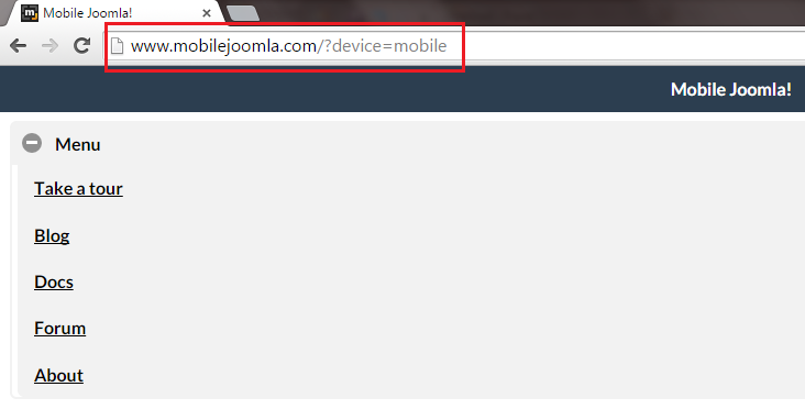
4) add ?device=
- http://www.yoursite.com/?device=mobile to test mobile version.
- http://www.yoursite.com/?device=tablet to test tablet version.
- http://www.yoursite.com/?device=desktop to switch back to desktop version.
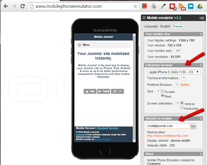
Mobile phone emulator (by COWEMO)
Mobilephoneemulator.com a mobile phone emulator that enables you to test the display of any website in many cell phones.
With this online mobile emulator (although there isn't much information disclosed on the accuracy of the tool), you can select lots of devices from a dropdown list and enter your website URL to test it.
Price: Free, you can get JavaScript API access from USD $50 per month.
Opera Mobile Emulator for Desktop
Opera Mobile Emulator is software created by Opera for web developers and designers to test websites on the Opera Mobile browser. It has the exactly same engine and UI as Opera Mobile on mobile phones. There are, however, some extra debugging tools available, such as keyboard shortcuts, the profile selector, and various command-line flags. Check out detailed description on the use of Opera Mobile Emulator.
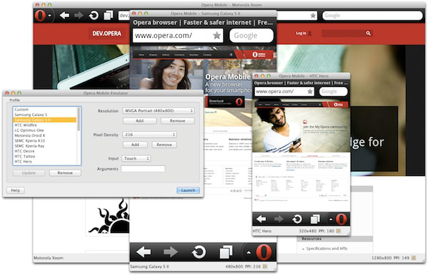
Works on: Windows, Linux, Mac OS X.
Requirements: Just a download from the Opera site.
Pros:
- It’s an emulator, so you don’t need any real phones for testing.
- It comes pre-configured with a series of phone and tablet device profiles (User Agent strings).
- There’s also an online and downloadable Opera Mini Simulator for feature phones that run the Java-based Opera browser.
- Customizable User Agents - Users can freely change the UA string.
- Super simple to install and easy to use. No need to install any complex SDKs or the like.
- Various input modes - There are three input modes available: touch, keypad and tablet.
- All modes can be activated and controlled by links and controls.
- Bookmark sync - Opera Mobile Emulator can be integrated with Opera Turbo and Opera Link to enable bookmark sync for faster testing.
- Remote debugging with real devices - you can do remote debugging by installing also Opera Dragonfly that contains useful features such as DOM, CSS, Network Inspectors, JavaScript Debugger, Command Line and Error Console.
Cons:
- Media support may not be perfect.
- By default, only User Agent Strings for the platforms Opera Mobile runs on are included. However, it's possible to add iPhone User Agent to Opera Mobile Emulator as a custom UA string.
- The emulator displays how pages look using the Opera mobile browser -- as known, not all features work similarly in different browsers. Even more so in the mobile world.
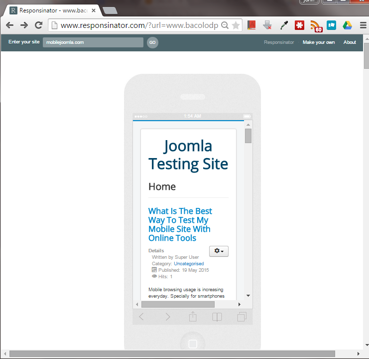
Responsinator
http://www.responsinator.com Responsinator - With this tool you can quickly test mobile sites on the few top iOS and Android devices. It takes in a URL and then outputs a sequence of device mockups with the web page rendered in them so you can get an idea of how the page layout will be experienced by your users in various devices. It only includes a limited set of devices, and is intended for quick visual checking rather than seeing exact device behavior.
Price: N/A (Donation Only)
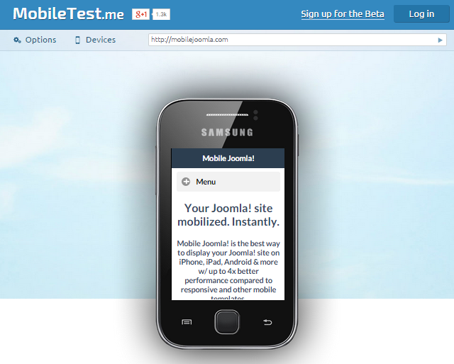
Mobiletest.me
http://mobiletest.me Very simple way of testing your mobile sites and web applications right from your browser.
Price: $9.99/month - One price, unlimited testing. (For more information about pricing, please see this link)
Browshot - Testing Mobile Websites
Browshot is a service to easily create screenshots of web pages in any screen size, as any device: iPhone, iPad, Android, Nook, PC, etc. The service is simple to use: you get to select a mobile device, the screen orientation, and then you can request a screenshot of any website. The shot will be generated using the Browshot's virtual browsers and delivered to you almost instantly (they mention an average of 15 seconds).
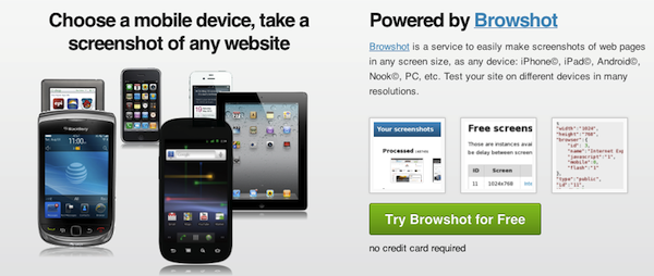
There are a few limitations, however: First, there’s a quite limited set of mobile devices; Second, apparently the screenshots are cached for 24 hours, so same day changes with the exactly same URL won’t show up (this could be bypassed by adding empty parameters to the URL, or using their API). For high-volume customers the firm also offers customizable browser setups (e.g. any screen size ratio).
Works on: Any browser
Requirements: N/A
Price: Browshot uses credits system for paying for the screenshots. Mobile shots take 2 credits. You can get 20 credits for free for signing up to their newsletter and sending a tweet. You'll also get 100 free screenshots a month. Credits are sold in packs starting from $1 per 10 credits and up to $1,000 per 300,000 credits.
Pros:
- Very easy, simple, and fast to use (the average time, including page load, to finish a screenshot is just 15s).
- Affordable pricing for small batches.
- Configurable - each feature (Flash/HTML5/CSS/JavaScript/Image loading) can be enabled and disabled on demand. They also have an API.
Cons:
- Limited device selection.
- Iterative development difficult with only screenshots - also, the service caching can be a nuisance.
BrowserStack - Web-Based Cross Browser Testing
BrowserStack is a web service that offers a complete range of browsers for cross browser testing. The service is available online instantly without any downloads or installs.
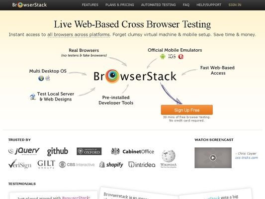
While the service started with desktop browsers, it now also includes official mobile emulators of iOS, Android, and Opera Mobile, so you can test how the sites work on iPhone, iPad, various Android devices, plus some others that support Opera Mobile (see full device list). BrowserStack also features advanced functionality like local tunnel testing of private sites and pre-installed debugging tools.
Works on: Windows, Mac OS X (Linux coming soon)
Requirements: You don’t need to install anything, just need a browser and Flash.
Pricing:
- Free for Open Source: We love open source projects. Choose any of our plans. Contact us with details of your project.
- $12.50/mo for Freelancers: 100 minutes of Live. Only 1 license/account. $12.50/mo , Billed annually. $19 month-to-month.
- Live $29 license/month: For teams focused on cross-browser compatibility.
- Automate $59 license/month: For teams with Selenium or JavaScript tests.
- Automate Pro $99 license/month: For test-driven development teams.
For more information about pricing, please see this link.
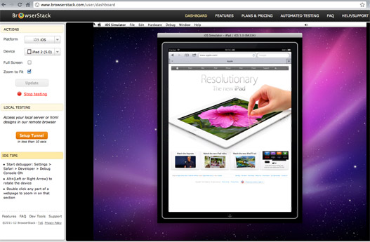
Pros:
- Instant access to iOS, Android, and Opera Mobile emulators (+ all major desktop browsers)
- No installation required
- Advanced developer tools
Cons:
- Limited amount of different mobile devices available
- Needs a good block of available memory to run
Built-in Mobile Developer Tools of Chrome, Firefox and Safari
All these browsers come with built-in mobile testing tools. To access the mobile developer tools, on all browsers you can right click anywhere on a website and select Inspect Element from the drop-down menu, or use keyboard short cuts key F12 or CTRL + SHIFT + I on Windows, or Cmd + Opt + I on Mac. (Further shortcut instructions for Chrome, Safari and Firefox.)
Chrome's Device Mode & Mobile Emulation
The Device Mode comes with presets of device information including screen width, height, and device pixel ratio from popular devices, like Nexus 5 and Samsung Galaxy series.
Changing the device also changes the User Agent string of the browser (remember what we discussed above in the beginning?), which ensures that you will also see the results of any server-side device-specific processing that might be happening.
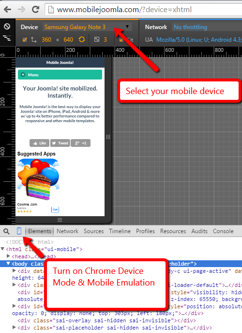
You can use these tools to:
- Test your responsive designs by emulating different screen sizes and resolutions, including Retina displays.
- Evaluate your site's performance using the network emulator, without affecting traffic to other tabs.
- Visualize and inspect CSS media queries.
- Accurately simulate device input for touch events, geolocation, and device orientation.
- Enhance your current debugging workflow by combining device mode with the existing DevTools.
For more information, please visit Chrome's official site: Device Mode & Mobile Emulation
Firefox's Responsive Design View
Firefox has a mobile development view as well, allowing you to get a preview of how a responsive design website will look on different screen resolutions (mobile phones, tablets, PC, etc).
However, it's important to notice that changing the screensize this way in Firefox does NOT change the User Agent string of the browser - it will still show up as desktop Firefox, which means you may miss server-side device-specific processing magic.
The UA string change is buried in Firefox’s about:config page, which is not very handy. Luckily, there's an extension which allows you to change the User Agent easily: User Agent Switcher. The extension only comes with a limited amount of devices, but you can download a whole lot more User Agent strings from Techpatterns.com. You can download all UAs in the same XML and just directly import the file to User Agent Switcher (In Firefox, select Tools->Default User Agent->Edit User Agents->Import).
To enable, select Firefox's menu > Web Developer > Responsive Design View (CTRL+SHIFT+M).
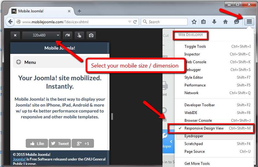
Features:
- Size Selection
- Portrait / Landscape
- Screenshot
- Simulate touch events
- and more controls.
Fore more information, visit Firefox Developer Tools home page.
Safari - Using iPhone, iPad and iPod Touch Website Testing
Safari browser also has a built-in mobile emulator for the iOS devices, and allows you to change the device User-Agent into also non-iOS devices.
These screenshots will guide you how to use Apple's Safari web browser for testing your iDevice-ready website by simulating an HTTP request from Safari on the iPad, iPhone and iPod Touch.
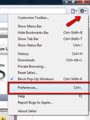
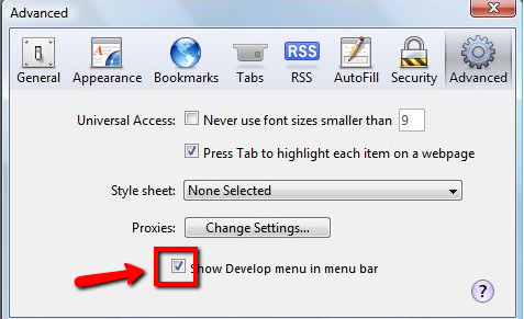
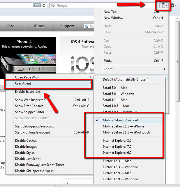
Check the official site of Safari Developer Tools for more details.
Mobile Emulators from Device Manufacturers
Device Manufacturers, or OEMs, typically provide desktop emulators of their platforms. Often these are aimed more toward native application development, but they can also be used for mobile website testing. Typically the emulator provided by the device manufacturer or OS provider is the closest-matching alternative to real device testing, although it’s not always the case. In the following we will present some of these manufacturer tools.
BlackBerry Simulators
BlackBerry simulators are provided by RIM for web developers to do BlackBerry compatibility testing on various devices. There’s support for keyboard, and trackpad/trackwheel/trackball input. The tools also allow running and debugging BlackBerry applications on desktop computers.
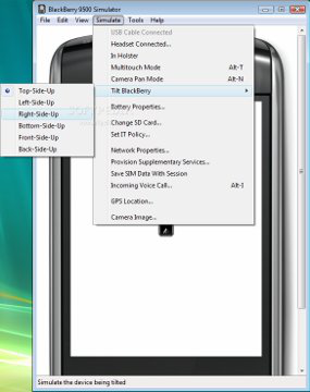
Works on: Windows, Linux and Mac OS X.
Requirements: VMware Player on Windows or VMware Fusion on Mac needs to be installed.
Pros:
- Most of the typical device functionalities, even advanced like push notifications, can be tested. Very close to real device.
Cons:
- Complex SDK, so there may be installation and other issues if you’re unlucky, and if you only want to test the browser, installing whole SDK is redundant.
Windows Phone Emulator
Windows Phone Emulator is a desktop tool to emulate Windows Phone 8. Installation gives you a mobile environment where you can test, view, and debug Windows Phone apps and use the browser to check websites. Windows Phone Emulator is designed to provide comparable performance to an actual device.
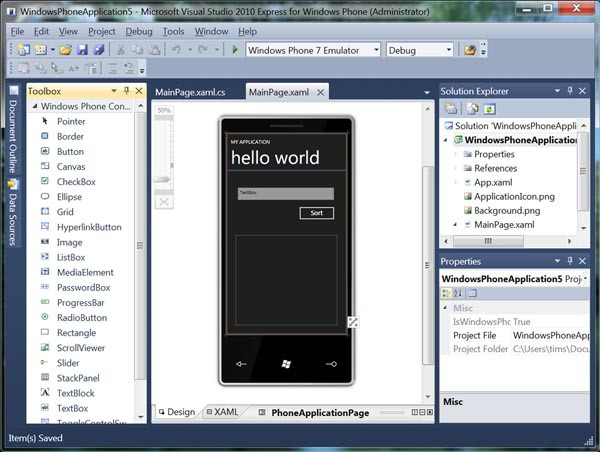
Requirements: You need to download and install Windows Phone Developer Tools.
Pros:
- Full-blown SDK with device emulator.
- Allows for in-depth developer access.
- Check on device peripherals, processor speed, RAM, display resolution and GPU.
- Lots of language versions available.
Cons:
- Only works on Windows.
- Heavy and complex SDK with lots of requirements.
- Some complaints about slow performance.
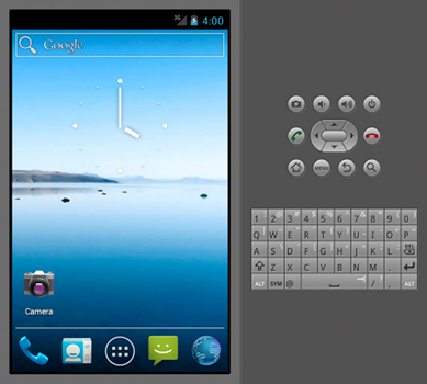
Android Studio
Android Studio emulator enables you to create a virtual mobile device on which you can run Android applications and test mobile websites. It has Android system stack and includes pre-installed applications that you can access. You can find the emulator inside Android SDK package.
Works on: Windows, Mac OS X, Linux.
Requirements: You need to download and install the Android SDK before you can launch Android Emulator to run the browser to test your site. It is recommended that you use Eclipse Classic version, or a Java or Eclipse RCP version for running the Android SDK. Before doing this, make sure that you also have Java SE Development Kit (JDK) installed on your computer. In order to use the emulator, you must also create one or more Android Virtual Device configurations where in each of them you must specify which platform to run, which hardware to use and which emulator skin is your choice. You can also run Firefox Mobile on top of the Android SDK.
Pros:
- Full-blown SDK with device emulator.
- Allows for in-depth developer access to e.g. telephony, SMS, and SD card emulation.
- Geo location, extensive logging capabilities.
- Very close to real device.
Cons:
- Complex SDK with lots to install.
- Lots of unnecessary stuff if you just need the browser to test mobile websites.
Tips: The Android SDK is quite slow – it might be better to use an image from android-x86.org in VirtualBox.
Online Mobile Testing With Real Devices
Yes, it is also possible to test with the real mobile device online. Let's review some options.
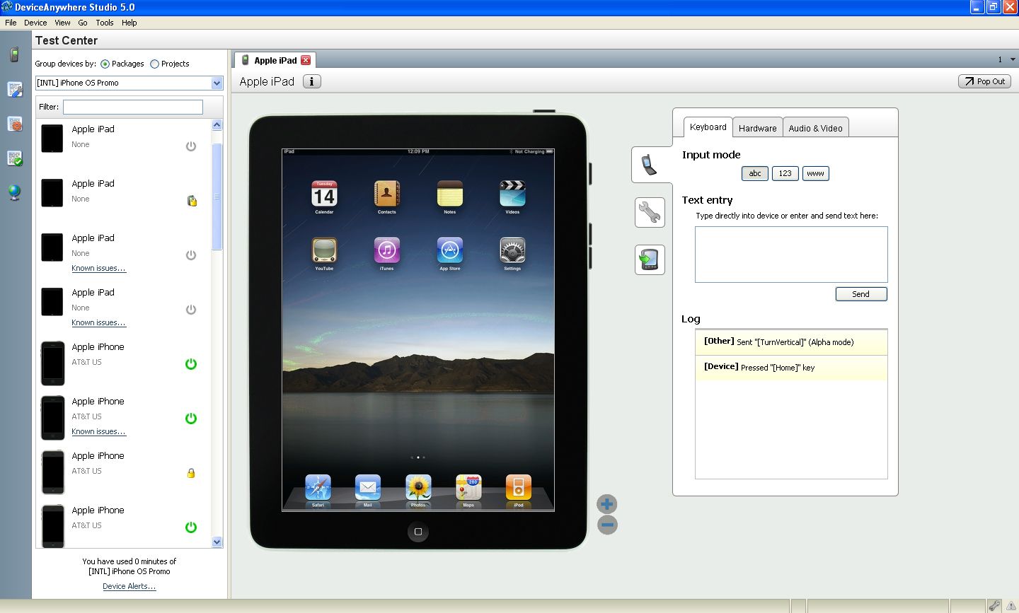
Keynote Mobile Testing (DeviceAnywhere)
Keynote Mobile Testing (previously known as DeviceAnywhere) provides testing access to a huge variety of mobile devices.
The specialty of the service is that they actually make use of remote connection to real devices – so it's the real thing you are testing against, and not just an emulator.
Keynote's service can be used for testing of mobile websites as well as HTML5 hybrid apps and native apps. The service is a bit skewed towards testing apps, though.
Works on: Windows, Linux, Mac OS X
Requirements: To test your mobile site with DeviceAnywhere, you need to sign up for an account. After you have obtained an account, you can download and install their software.
Pricing:
- FREE: Spot check your mobile apps and websites for a limited time on limited number of devices.
- PRO: Manual testing of your mobile apps and websites starting at $180 per month.
- PRO UNLIMITED: Unlimited manual testing of your mobile apps and websites starting at $500 per month / billed annually.
- ENTERPRISE: Automated testing of your mobile apps and websites starting at $750 per month / billed annually.
For more information about pricing, please see this link.
Pros:
- Easy to use.
- Great device selection.
- Test using real devices.
- Lots of advanced functionality available for automating tests etc.
Cons:
- Can get costly if you’re on limited budget.
- Clunky/slow Java UI.
- Since they use real devices, those may sometimes be broken or unavailable.
- Limited carrier networks choice.
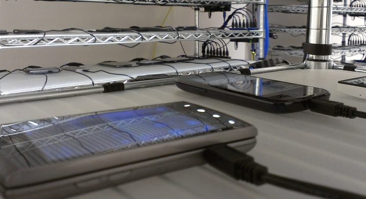
AppThwack
This website will test your website with 333 real devices (247 phones | 82 tablets | 4 PMPs).
Real, physical devices in the cloud
With AppThwack you can test your website with 300+ unique, non-rooted phones and tablets in our state-of-the-art device lab. They have real hardware and software, available 24/7 and 100% automated.
Example Test Results
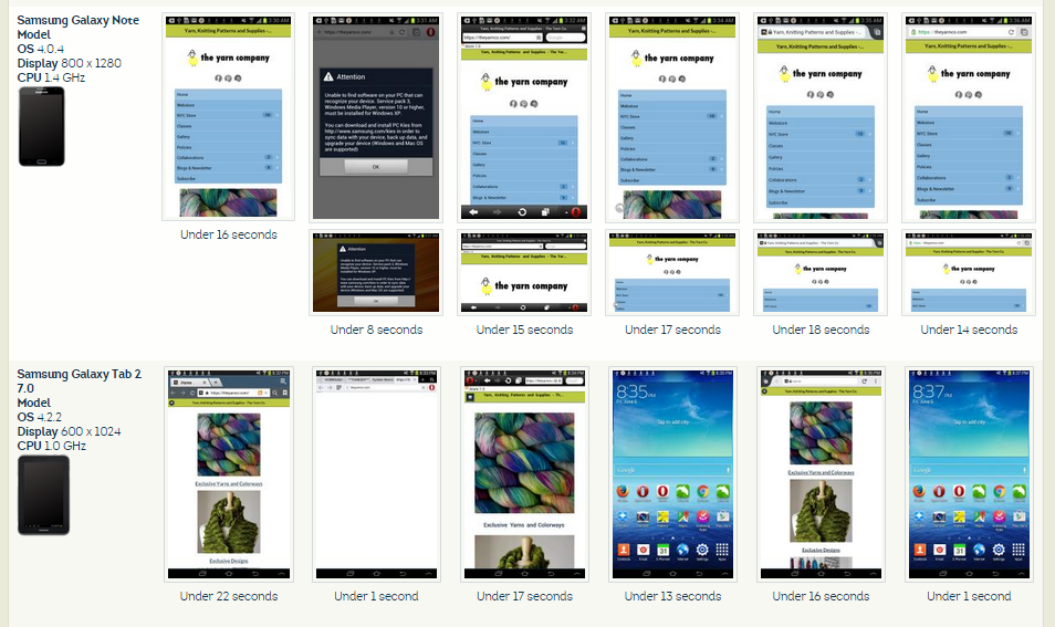
Pricing:
- Free: 100 minutes of testing.
- Micro $20/mo (up to 200d)
Validating
We can validate our mobile website created with Mobile Joomla! with the following tools:
Validator.w3.org/mobile
This checker performs various tests on a Web Page to determine its level of mobile-friendliness. The tests are defined in the mobileOK Basic Tests 1.0 specification. A Web Page is mobileOK when it passes all the tests.
If you wish to validate specific content such as markup validitation, or RSS/Atom feeds, or CSS stylesheets, or to find broken links, there are other validators and tools available.
Ready.mobi
The mobiReady testing tool evaluates mobile-readiness using industry best practices and standards. The free report provides both a score (from 1 to 5) and in-depth analysis of pages to determine how well your site performs on a mobile device.
Provides results for a single page:
- dotMobi compliance.
- W3C mobileOK tests.
- Device emulators.
- Detailed error reports.
Provides results for markup only:
- Useful during development.
- Live site not required.
- HTTP tests ignored.
- Detailed error reports.
Provides results for a whole site:
- Site wide testing.
- Report archive.
- Enhanced emulators.
- Detailed error reports.
Ready.mobi was developed a long time ago, and some its suggestions are not perfect at the present time. For example, most of mobile devices displays html markup well, but ready.mobi recommends to use xhtml markup, etc.
Bonus: Mobile Joomla! Pro
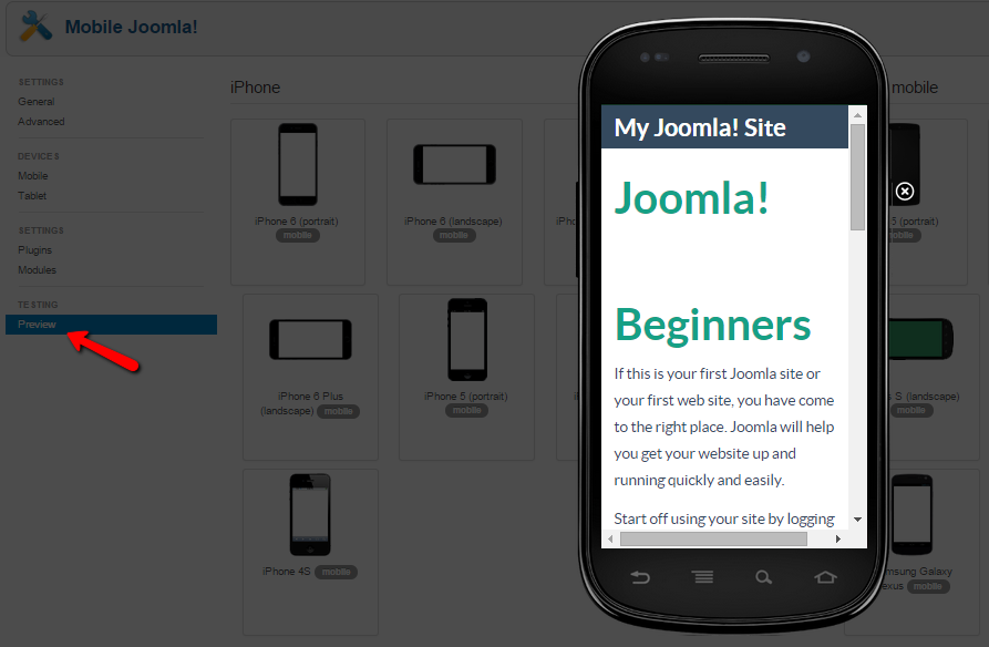
Mobile Joomla! Pro includes multiple back-end device simulators with which one can easily try out how the chosen settings affect the Joomla! site on the iPhone, Android, smartphones, and features phones.
While it may not completely remove the need to test advanced features with a large variety of devices, our aim has been to make it fast and easy for our professional users to make adjustments to their mobile site while seeing the results at the same time.
Have fund testing!
Do you have your own tips or comments for testing mobile sites on desktop and browsers, or have we missed something? Let us know in the comments below!
Become Mobile Joomla! 2.0 Beta Tester!
Wednesday, 06 May 2015 00:00
Update August 12, 2015: You can now download Mobile Joomla! 2.0 directly from our normal Download page!
Hey folks! We've been a bit quiet for a while, but now it's time to open up more about what we've been up to: Mobile Joomla! 2.0!
We are currently in the final Release Candidate phase, ironing out the remaining issues, polishing stuff and testing different environments. We're rolling out the official version in the next few weeks !
Some of the most interesting features of Mobile Joomla 2.0 include:
- Easier setup and better out-of-the-box functionality
- Improved image resizing to boost page load performance
- Better performance via page minification
- Ability to remove parts of page sources on mobile (or desktop, for that matter) using "ress-media" attribute
- IE conditional comments removal on non-IE browsers
- Improved the gzip compression
- Better performance by Javascript combination and minification
- Faster loading pages by CSS combination and minification
- Improved performance by removing unnecessary browser-specific CSS properties (apart from the visitor's browser)
- CSS rule split via media queries and loading the required files only
- Extended lazy loading of images and videos
- Automatic responsive script loading (like FastClick, FitVids, Add to Home, etc.) and viewport tag
You can get early access by joining the Beta tester group to help us to spot and iron out any issues in the new release and ensuring smooth out the install process for everybody.
Update August 12, 2015: You can now download Mobile Joomla! 2.0 directly from our normal Download page!
Thank you!
A Bunch Of Product Updates
Monday, 01 September 2014 15:02
Today we release several updates to our products:
1. Mobile Joomla! 1.2.10 and Mobile Joomla! Pro 1.2.12. Updated the local device detection database with the latest device information (used in Pro version if there's no connectivity to our online device database). Fixed: issues in the mobile_iphone template, and delay in checking for updates.
2. Elegance 1.3.23 and Flat 1.0.27 templates. FastClick and Add-to-homescreen libraries are updated to latest versions.
Mobile Joomla! Templates update: Elegance 1.3.20 and Flat 1.0.24
Tuesday, 06 May 2014 00:00
Hey guys, Mobile Joomla! templates Elegance and Flat have gotten a new business-as-usual-update which includes the latest versions of several underlying libraries:
- Included jQuery 1.11.1 and 1.2.1
- Updated Add to homescreen script to version 3.0.1
Added support for Mobile Chrome browser (both iOS and Android). Notice: current version 3.0.1 includes en_us, it_it, and nl_nl languages only. - Updated Fastclick script to version 1.0.1
Fix work with form elements in iOS - Updated FitVids script to version 1.1
Fix issue with style injection in Chrome - Updated LazyLoadXT script to version 1.0.2
Minor bugfixes
More Articles...
- New support ad types for better support
- Welcoming Lazy Load XT for jQuery: Lazy Load Images, Videos and Other Media
- Mobile Joomla! 1.2.8 and Mobile Joomla! Pro 1.2.10
- Elegance 1.3.11 and Flat 1.0.15 templates have been released
- Mobile Joomla! 1.2.7 and Mobile Joomla! Pro 1.2.9
- Mobile Joomla! templates Elegance 1.3.6 and Flat 1.0.10 have been released
- Elegance 1.3.2 and Flat 1.0.6 have been released
- Mobile Joomla! 1.2.6 and Mobile Joomla! Pro 1.2.8
Page 5 of 17
«StartPrev12345678910NextEnd»